SUMMARY
Challenge
To design a corporate identity for a travel start-up.
Opportunity
How Might We create a corporate identifier for a travel start-up that indicates movement without an airplane symbol or similar?
How Might We create a modern and versatile corporate identifier that is not childish so that the target audience notices it?
Intervention
An identifier that attends client's needs. It also includes a manual with its guidelines.
Results
An identity that the brand can sustain in the long term.
*More on the process below.
Principal Identifier
PROCESS
Design challenge
To design a corporate identity for a travel start-up.
ABOUT MONVIAGGIARE (THE CLIENT)
Monviaggiare is a travel coach that guides people in their travels without overpaying. The start-up finds inspiration in the desire to travel and help people in their mid-twenties travel around the world in a faster and more accessible manner. The brand's name comes from merging the founder's name (Montserrat) and travel in Italian (viaggiare).
Mission: To help people to accomplish their dream of traveling around the World.
Vision: To be an industry leader that helps people to travel around the World.
Value proposition: To travel without overpaying.
Short-term goals: To organize communication posts and launch a web page.
Perception: 'I want the brand to be perceived as dynamic, fresh, and juvenile'.
LOCAL COMPETITION
Most of their competitors have a generic airplane or location symbol within their identifier.

Competitors
insights
• The identifier must indicate movement
'I want the brand to be perceived as dynamic, fresh, and juvenile.'
• The identifier must be modern without being childish for it to be noticed by its target audience.
'The buyer persona's profile is for people in their mid-twenties that want to travel.'
• The identifier must be versatile as it has to work in reduced formats.
To organize communication posts and launch a web page.
• The identifier must have a solid symbol or logotype to differentiate itself from its competitors.
Their competitors include a generic airplane or similar symbol within their identifier.
Opportunity statements
How Might We create a corporate identifier for a travel start-up that indicates movement without an airplane symbol or similar?
The identifier must indicate movement.
The identifier must have a solid symbol or logotype to differentiate itself from competitors.
Their competitors include a generic symbol within their identifier.
How Might We create a modern and versatile corporate identifier that is not childish so that the target audience notices it?
The identifier must be modern without being childish for it to be noticed by its target audience.
The identifier must be versatile as it has to work in reduced formats.
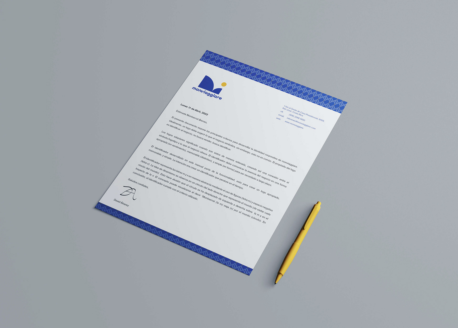
FRAMEWORK - EXCERPT FROM IDENTITY MANUAL
"An identifier acquires meaning only when people have seen it repeatedly. In this manner, an identifier can be associated with a product or service a business offers. An identifier does not have to communicate what the business is or what it sells explicitly. For example, no indicator within the Apple identifier displays that it is a technology company.
The job of the identifier is to identify, not to communicate. What is important is to extract the essence of the business so we can design a non-generic identifier. A way to do this is by using the framework of Appropriate, Memorable, and Simple. With this framework, we can innovate and not imitate.
With identity design, rarely is there love at first sight..."
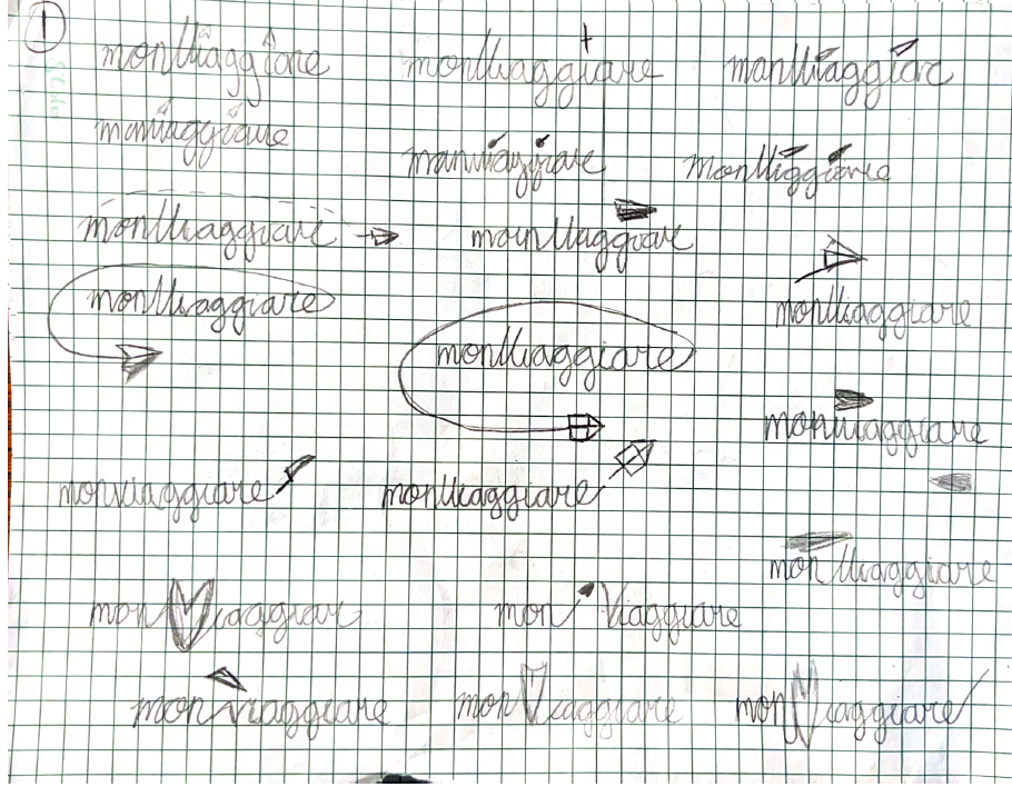
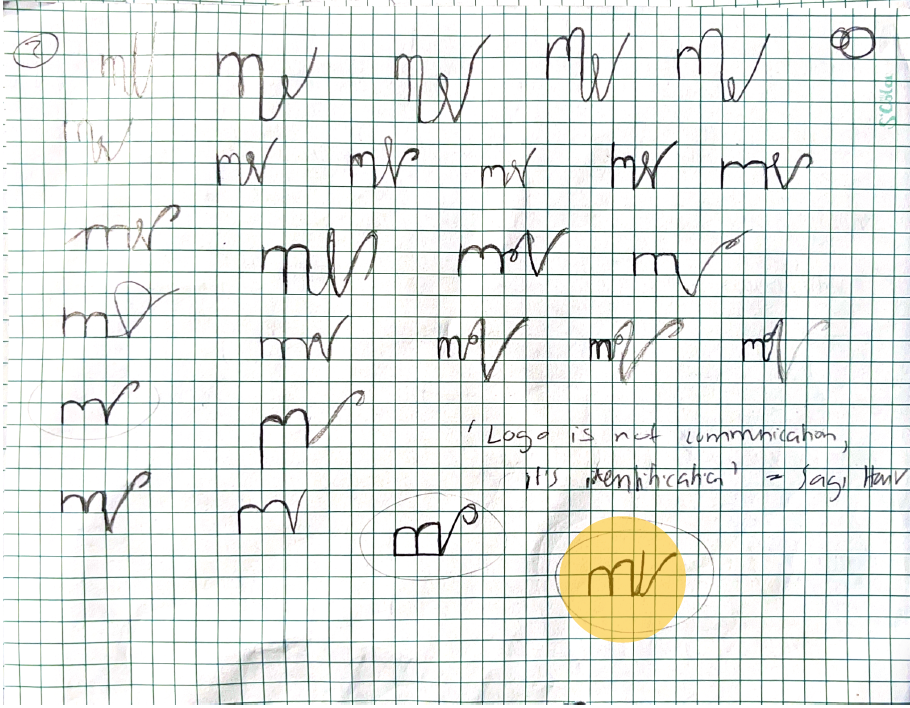
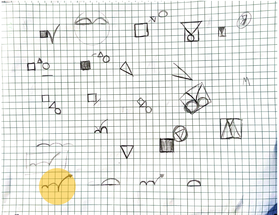
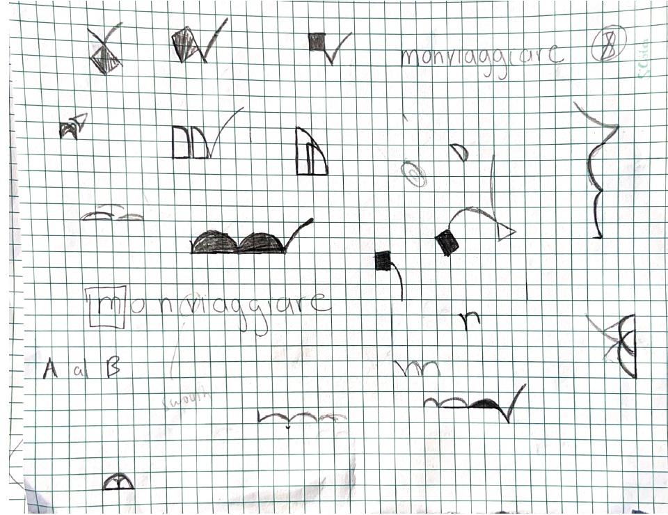
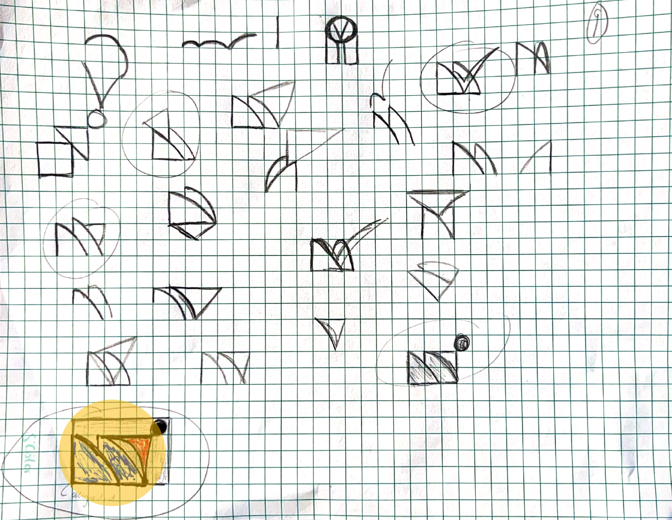
Concept Development
description
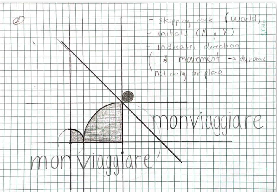
Below you can see the mood board, sketches, vectorization, and concept iterations. The concept finds inspiration in the Bauhaus way of forming letters with shapes, current identifiers made of shapes, and skipping a rock on the water.
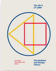
Bauhaus Shapes
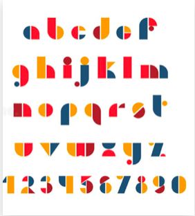
Bauhaus letters

Figma identifier

Skipping rock metaphor
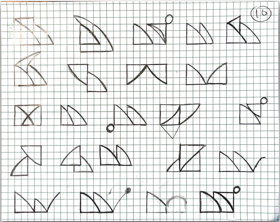
Initial sketches
Initial sketches
Initial sketches
Initial sketches
Initial sketches
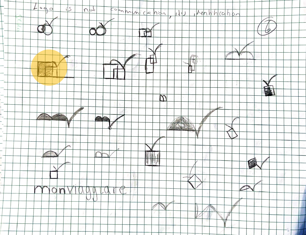
Initial sketches
Initial sketches
Initial sketches
Initial sketches
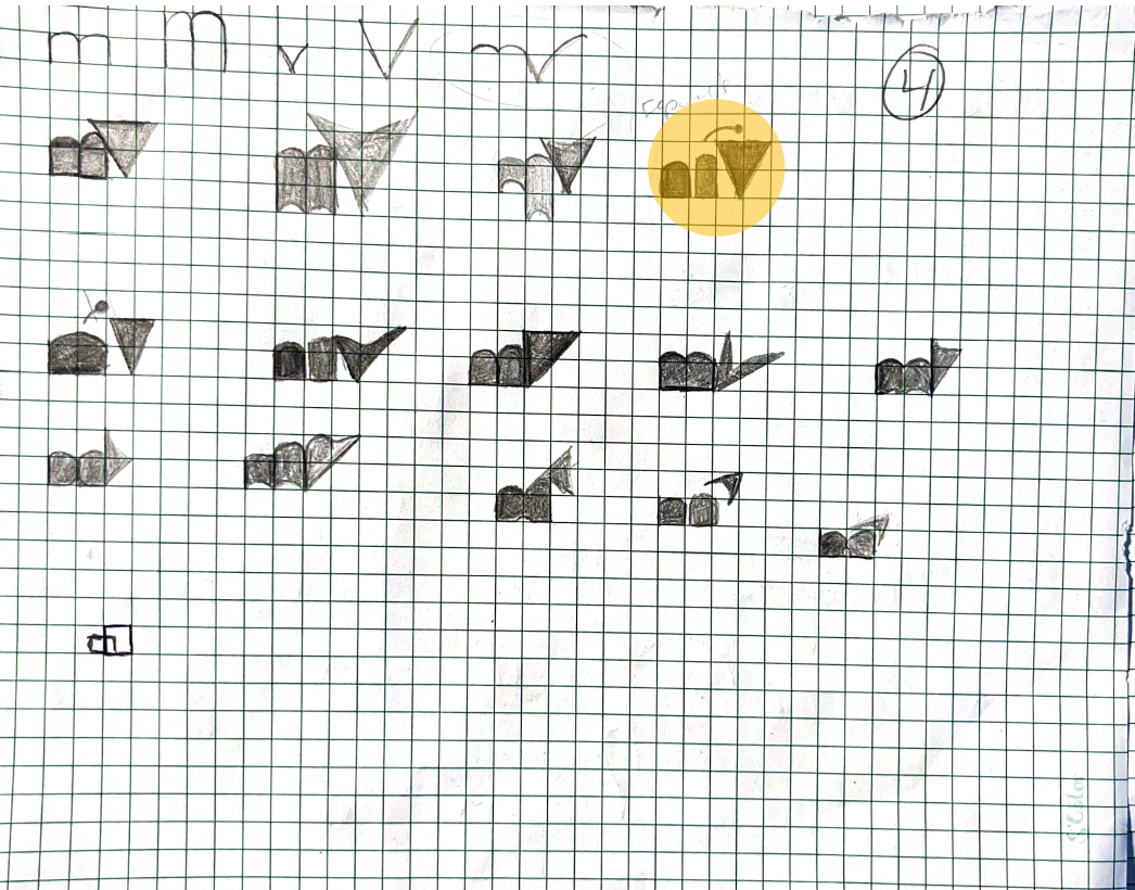
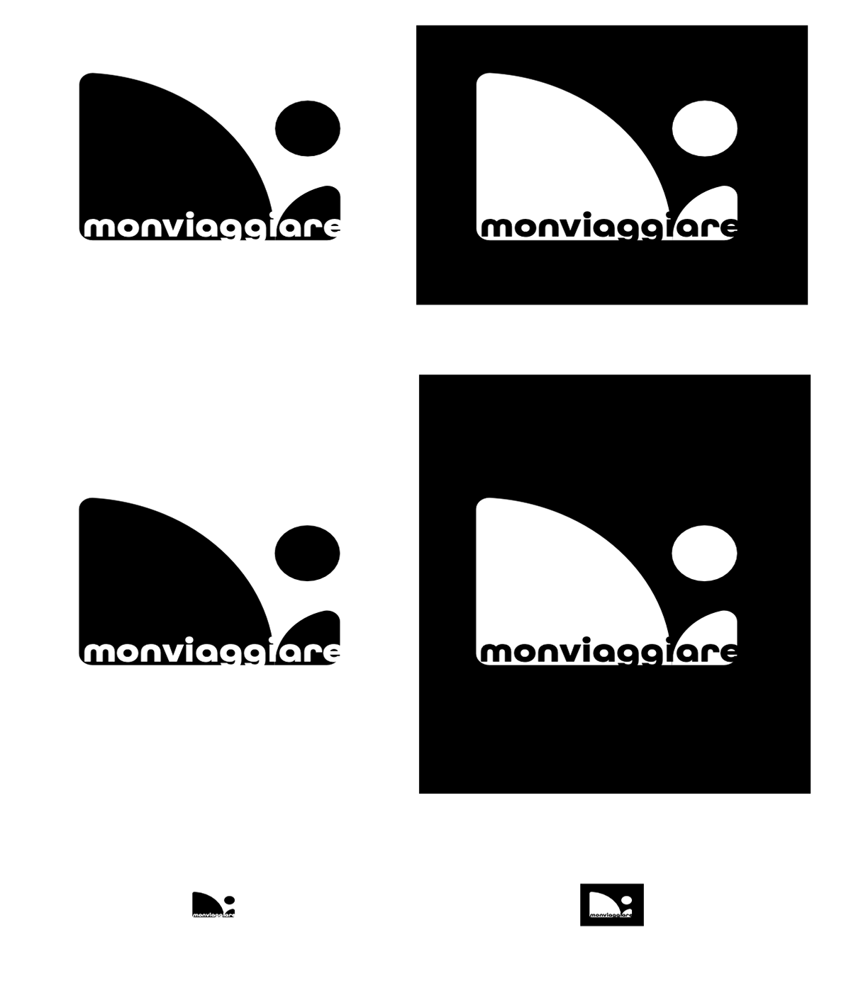
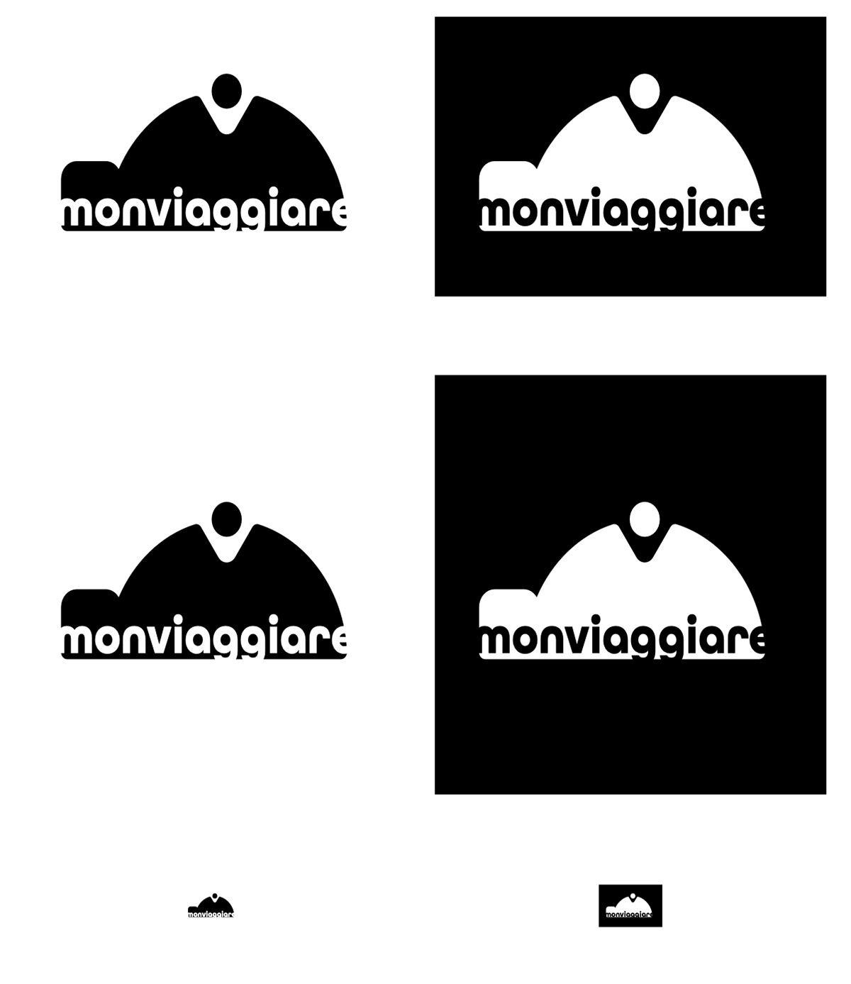
Refining
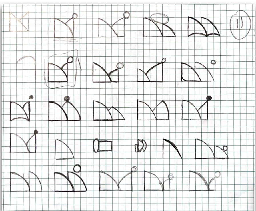
Refining
Refining
Refining
Refining
Refining
Refining
Refining
Refining
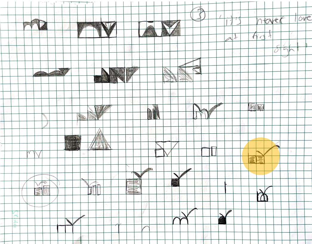
Initial Vectorization
Initial Vectorization
Initial Vectorization
Initial Vectorization
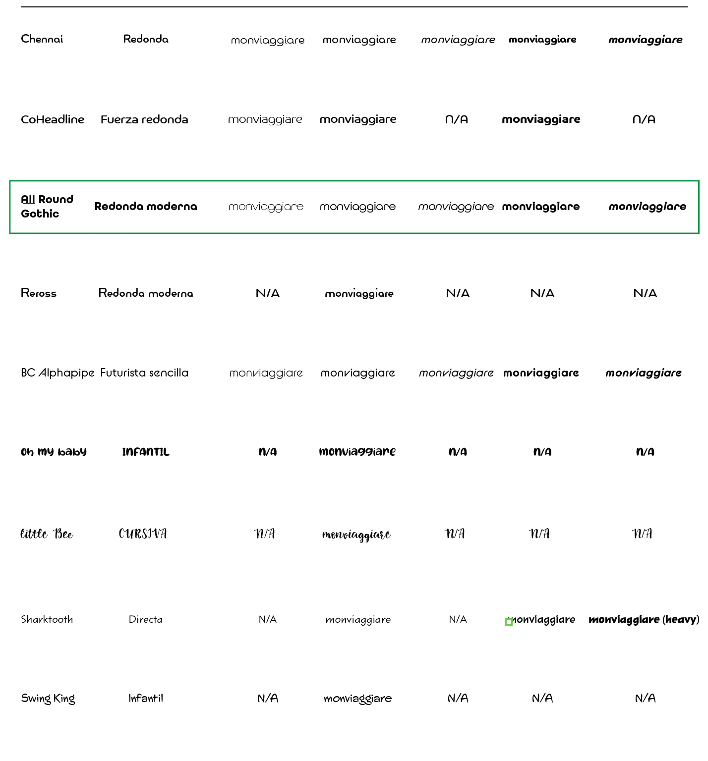
Type exploration
Refining
Refining
Refining
Refining
Refining
Refining
Color exploration
Color exploration
Color exploration
Color exploration
Color exploration
Color exploration
Color exploration
Color exploration
Color exploration
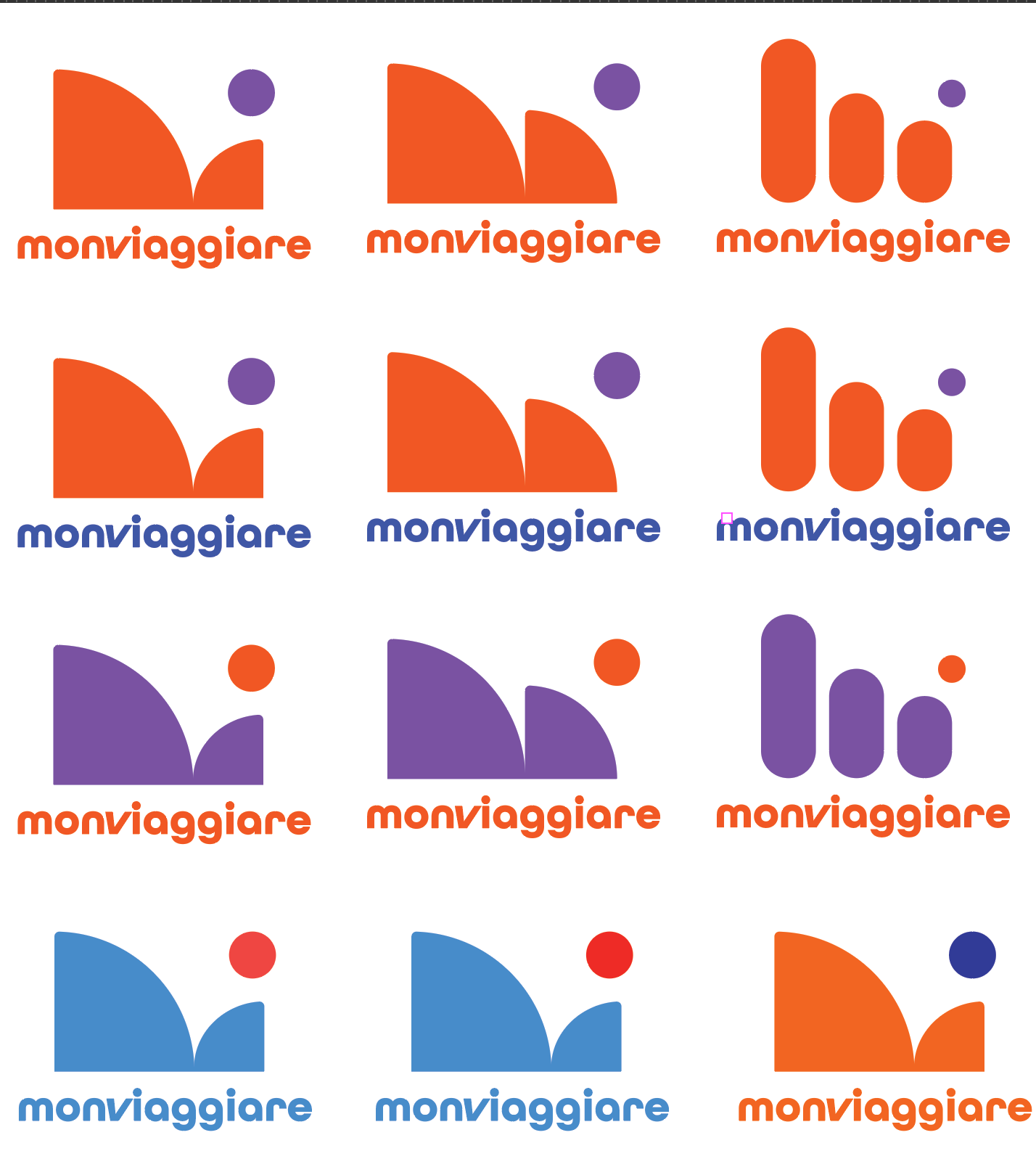
Color exploration
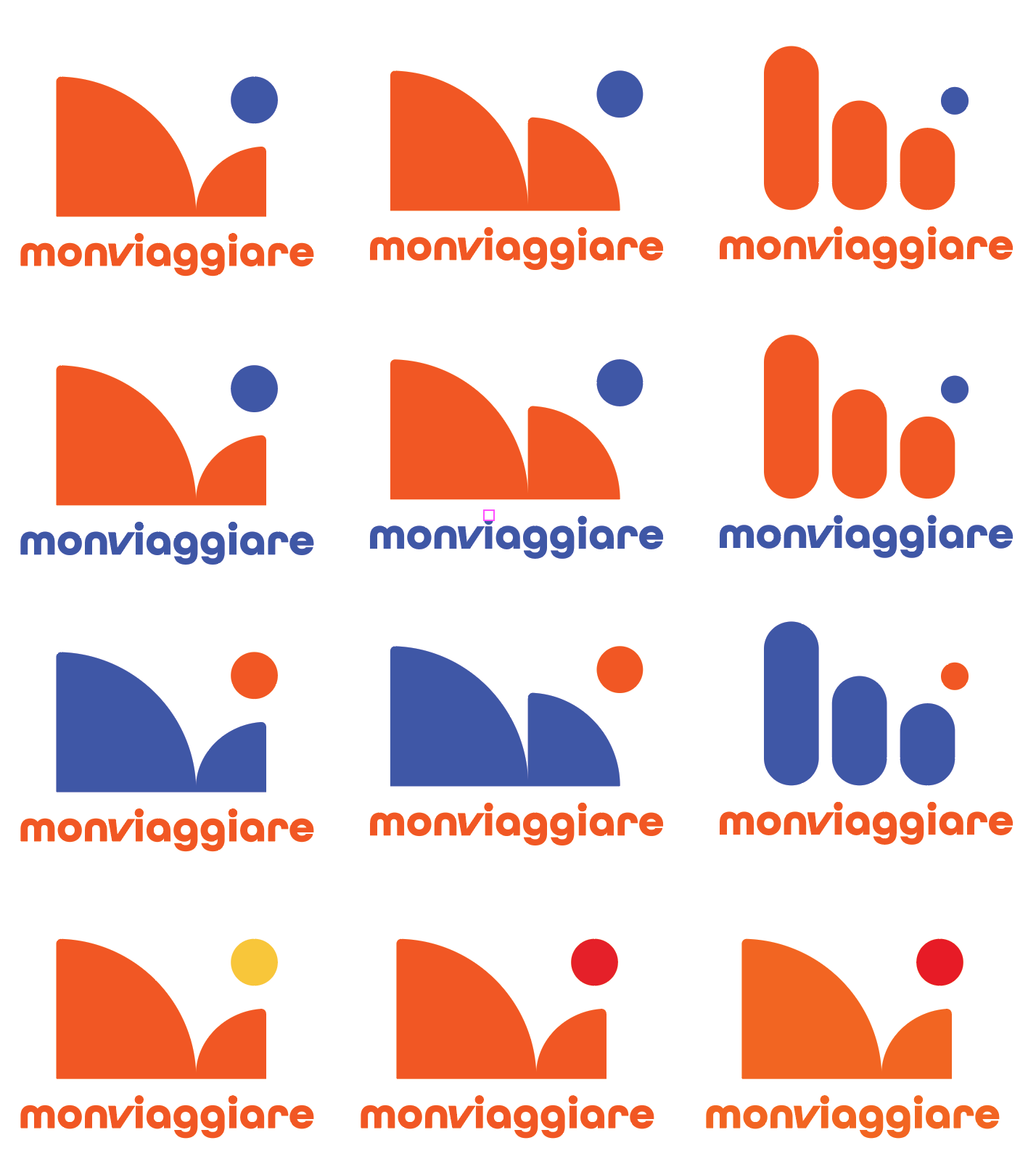
Color exploration
Color exploration
Color exploration
Color exploration
Color exploration
Color exploration
Color exploration
Color exploration
Color exploration
Color exploration
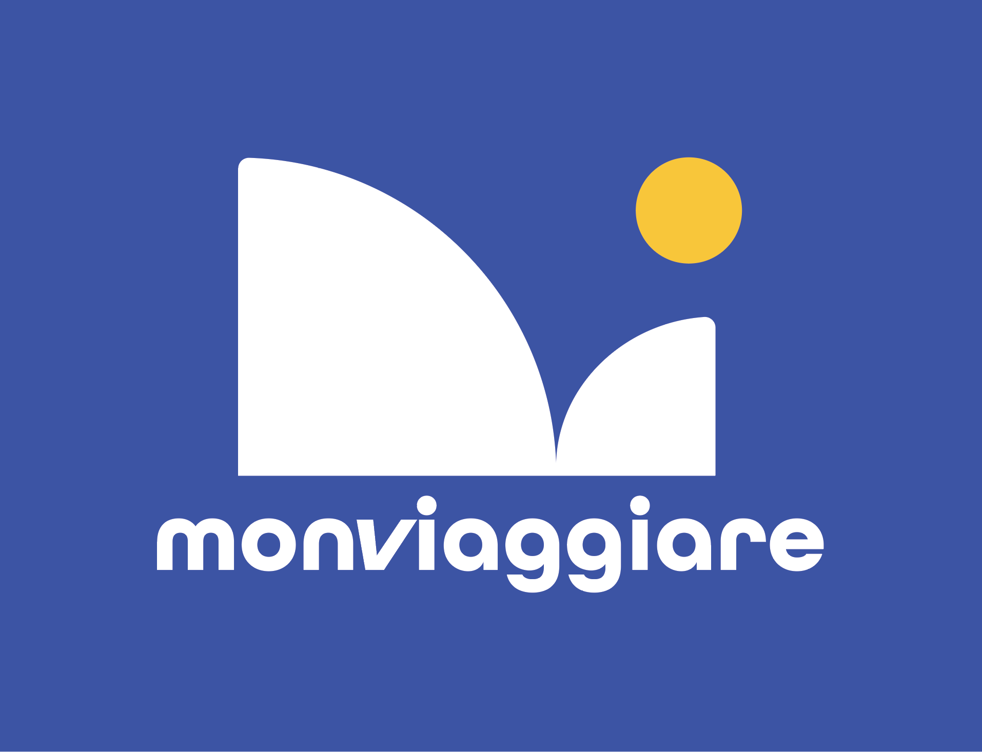
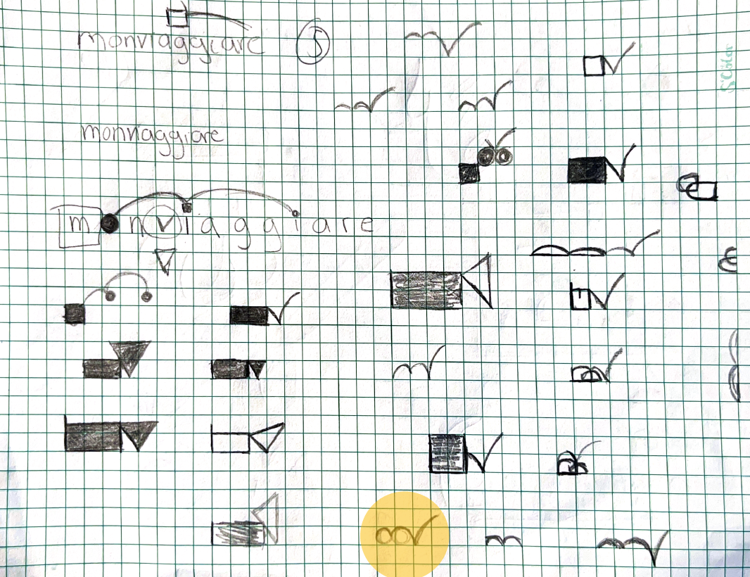
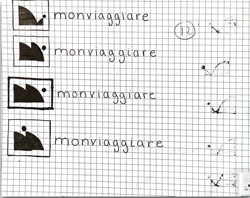
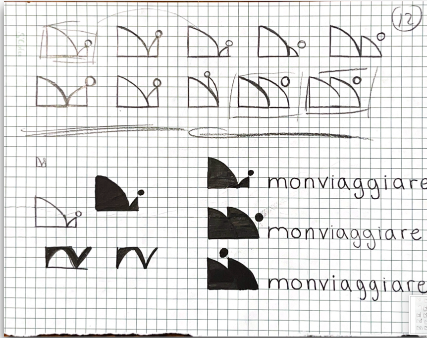
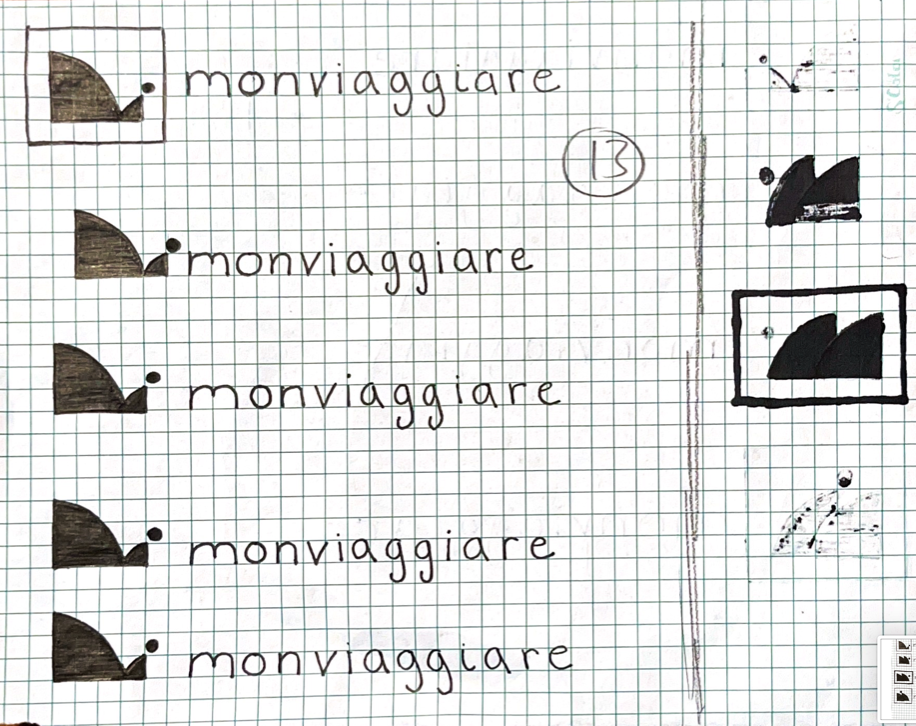
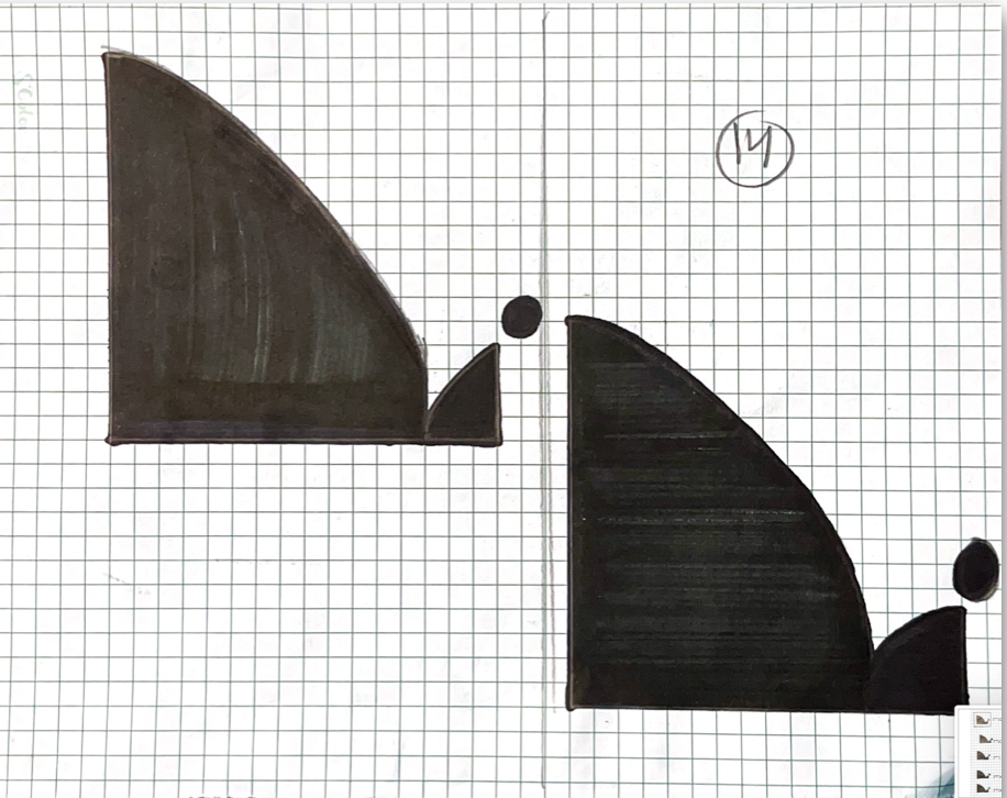
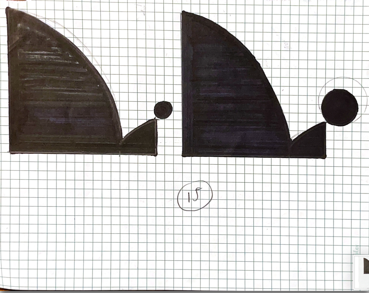
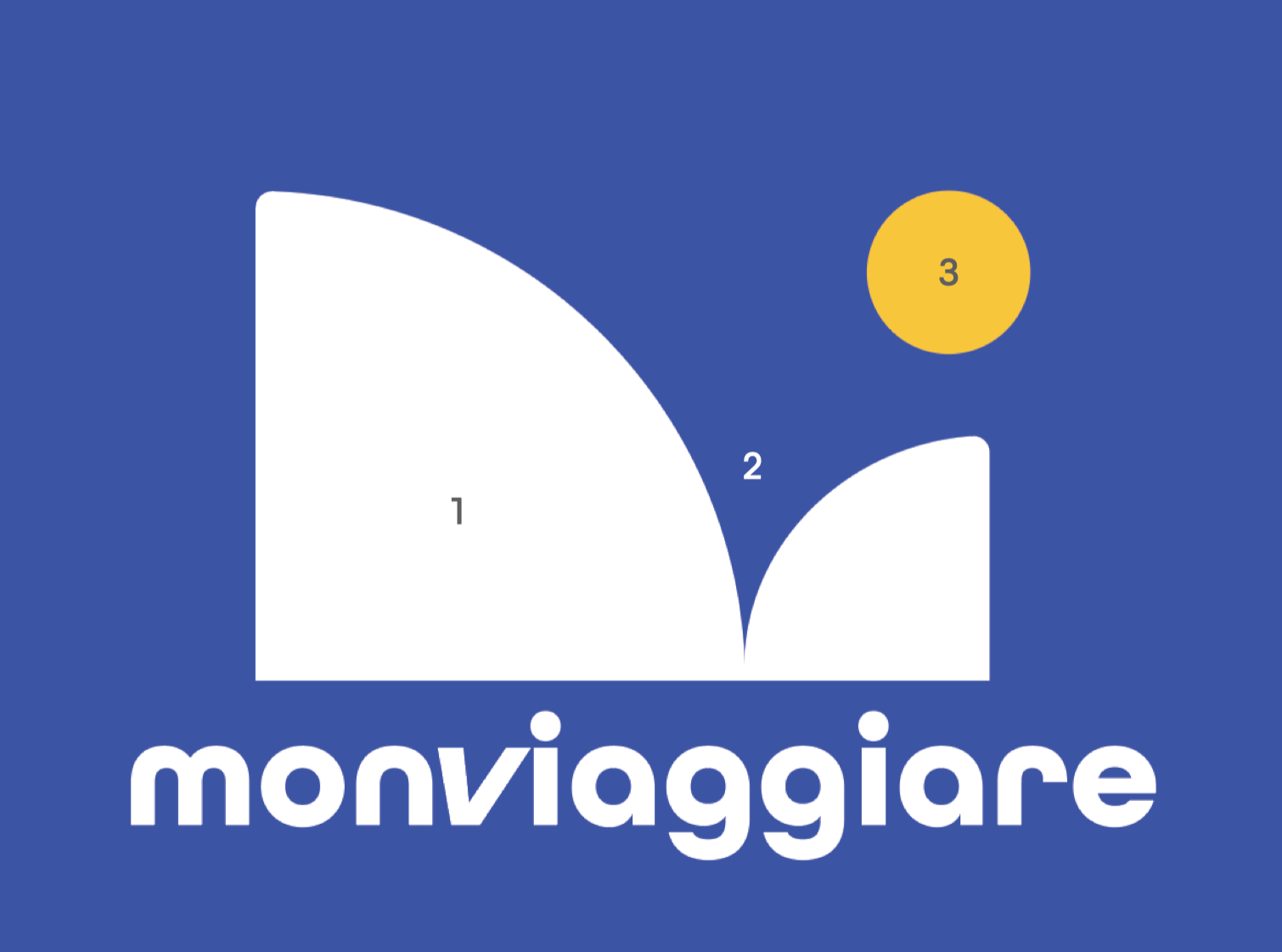
fINAL CONCEPT
description
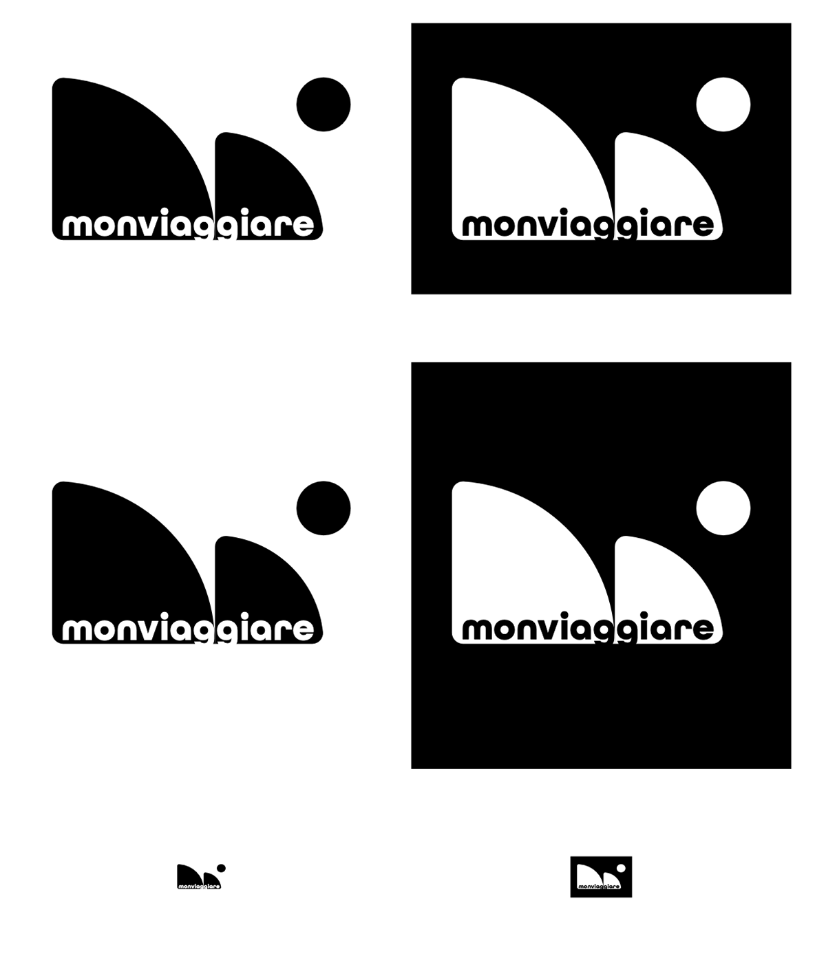
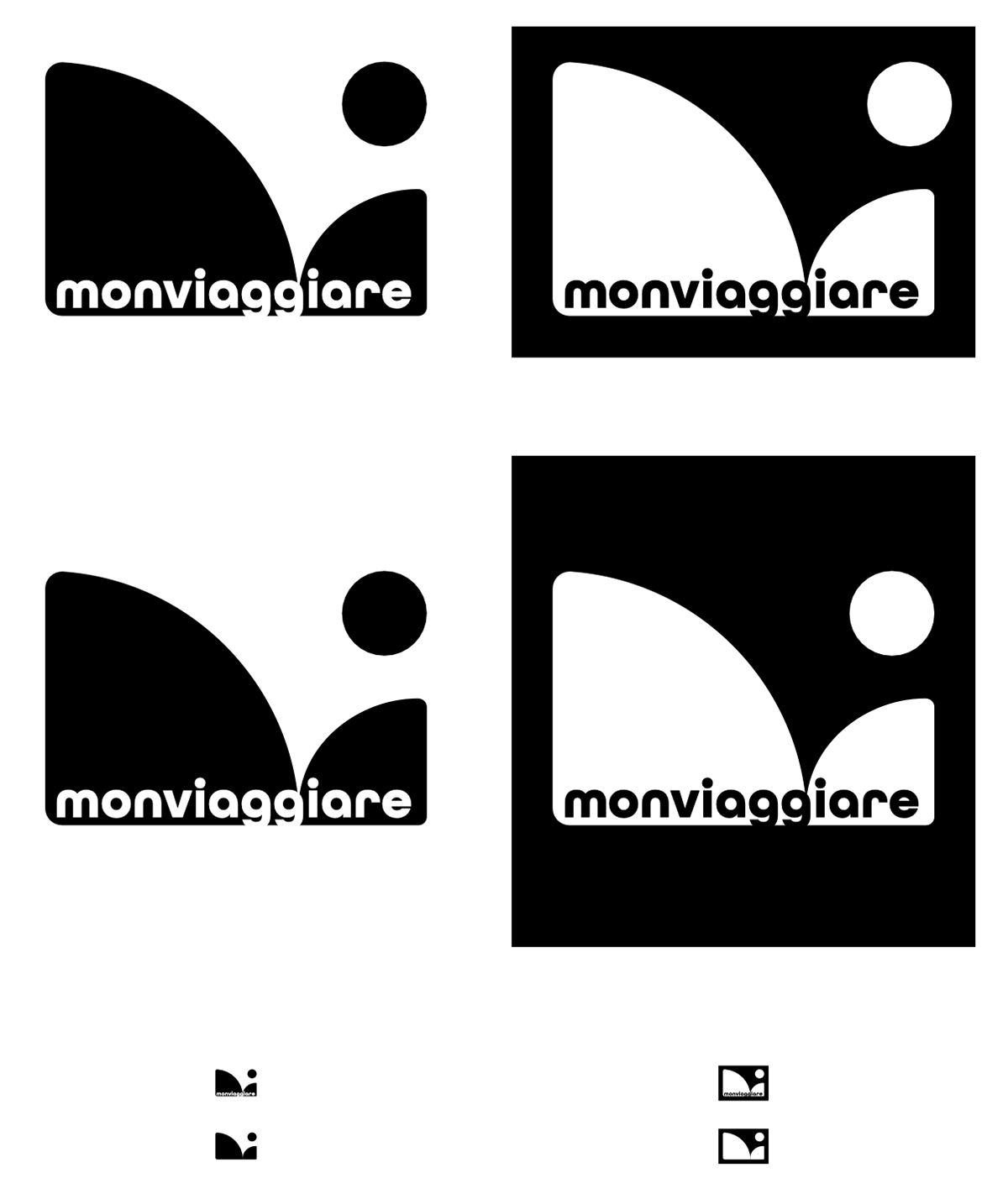
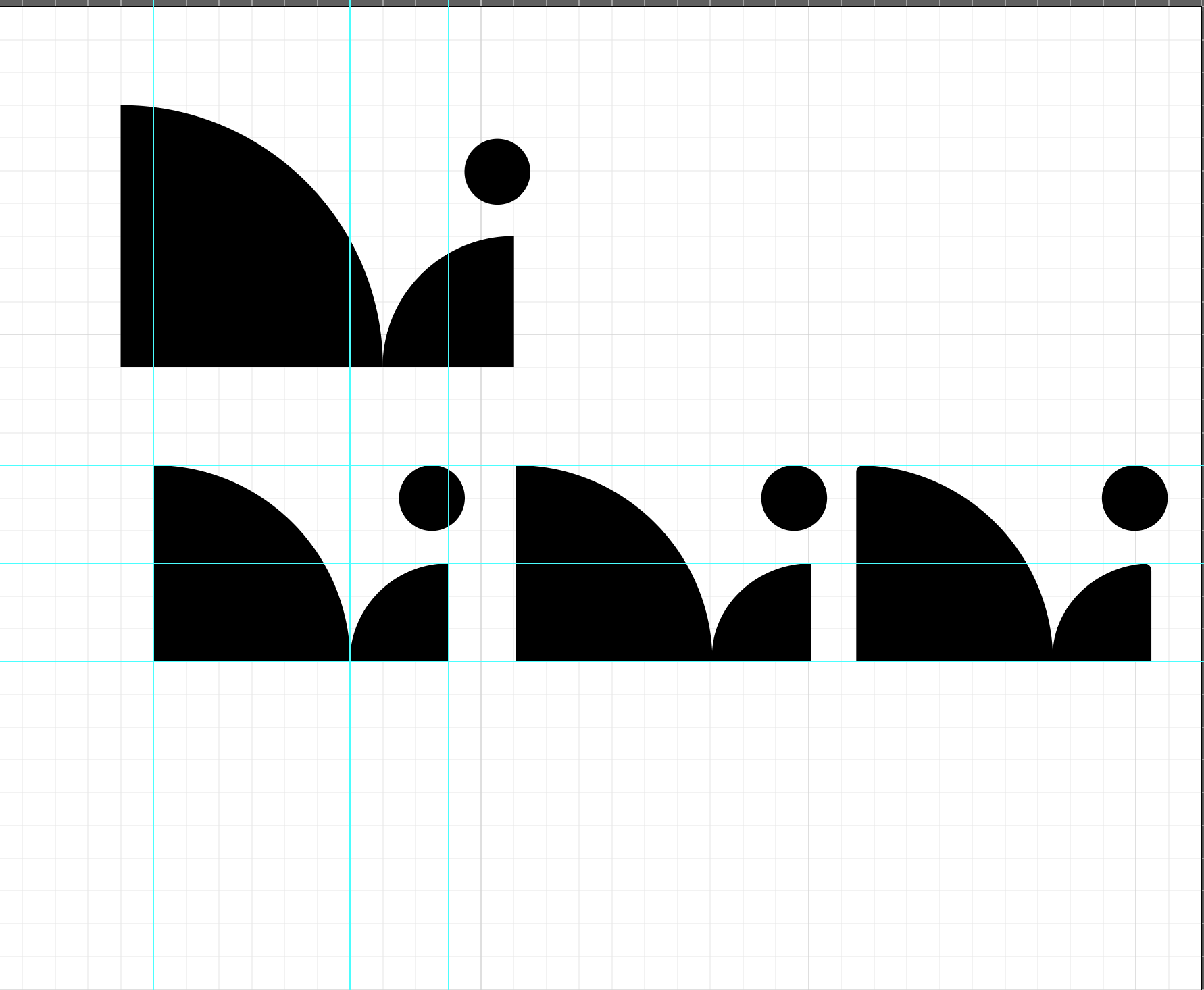
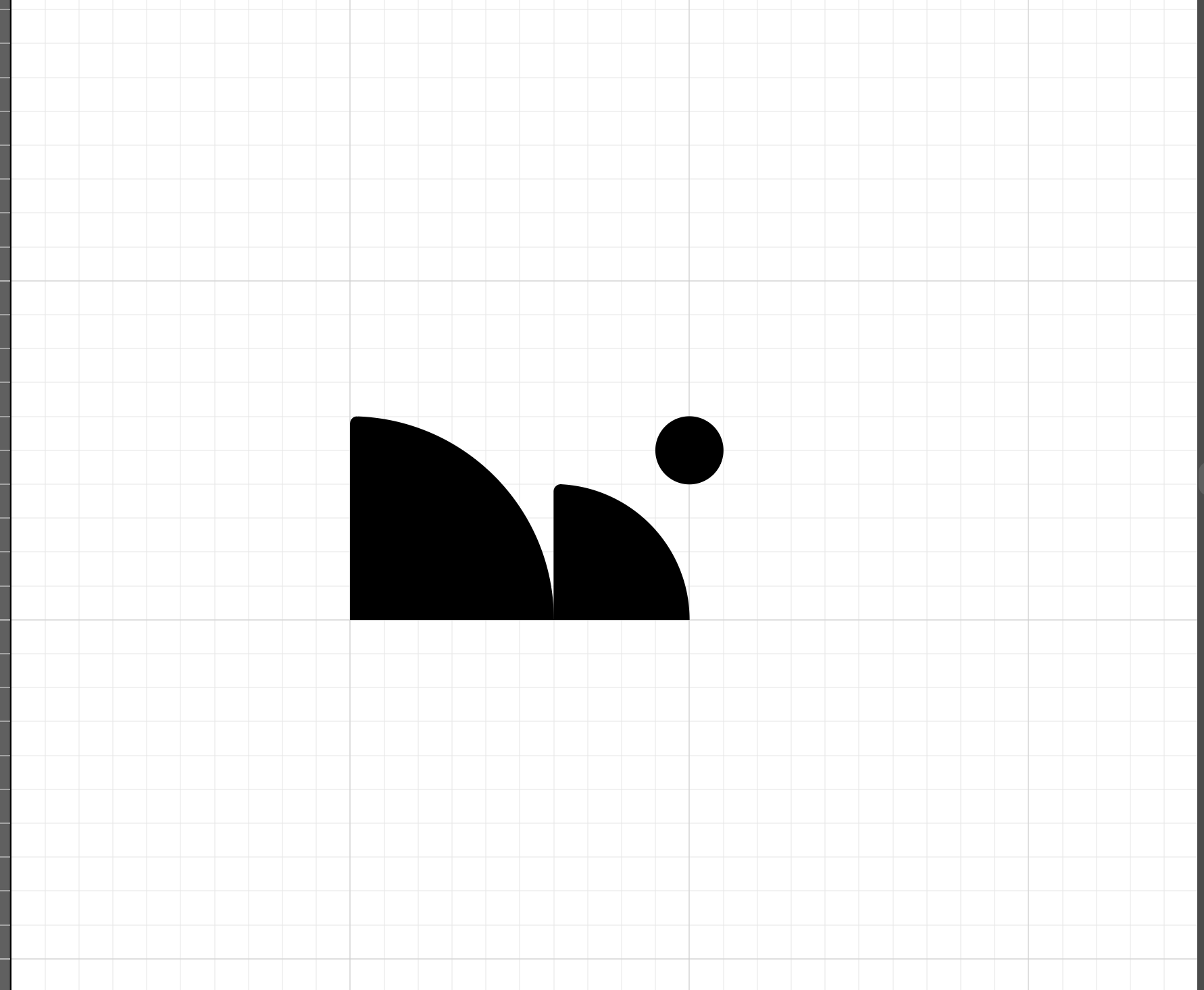
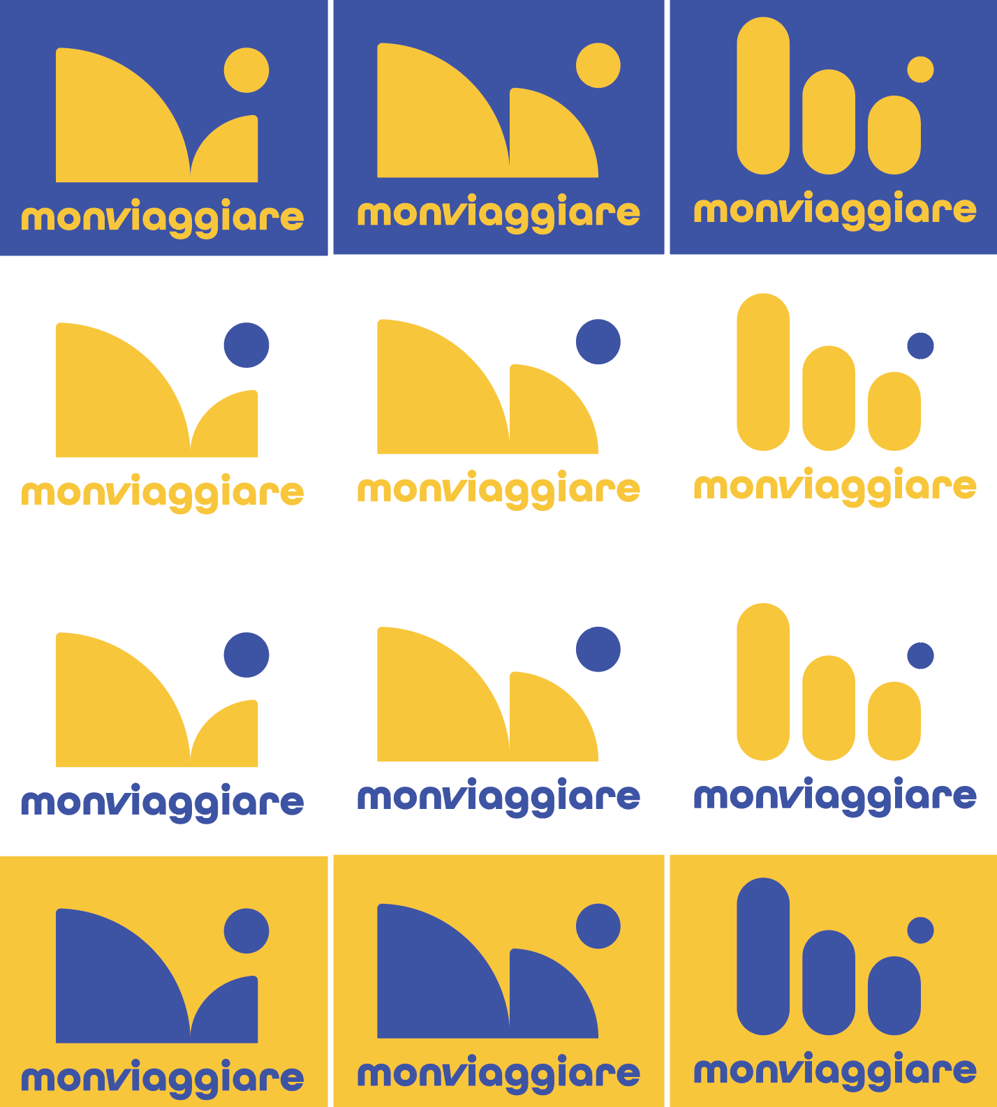
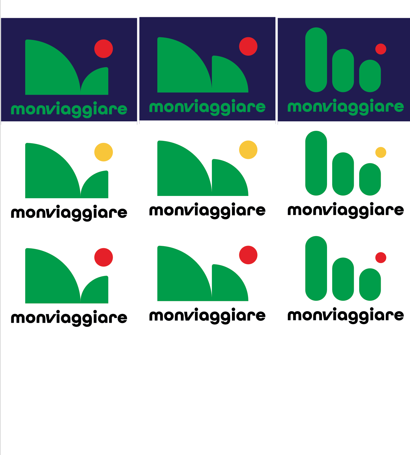
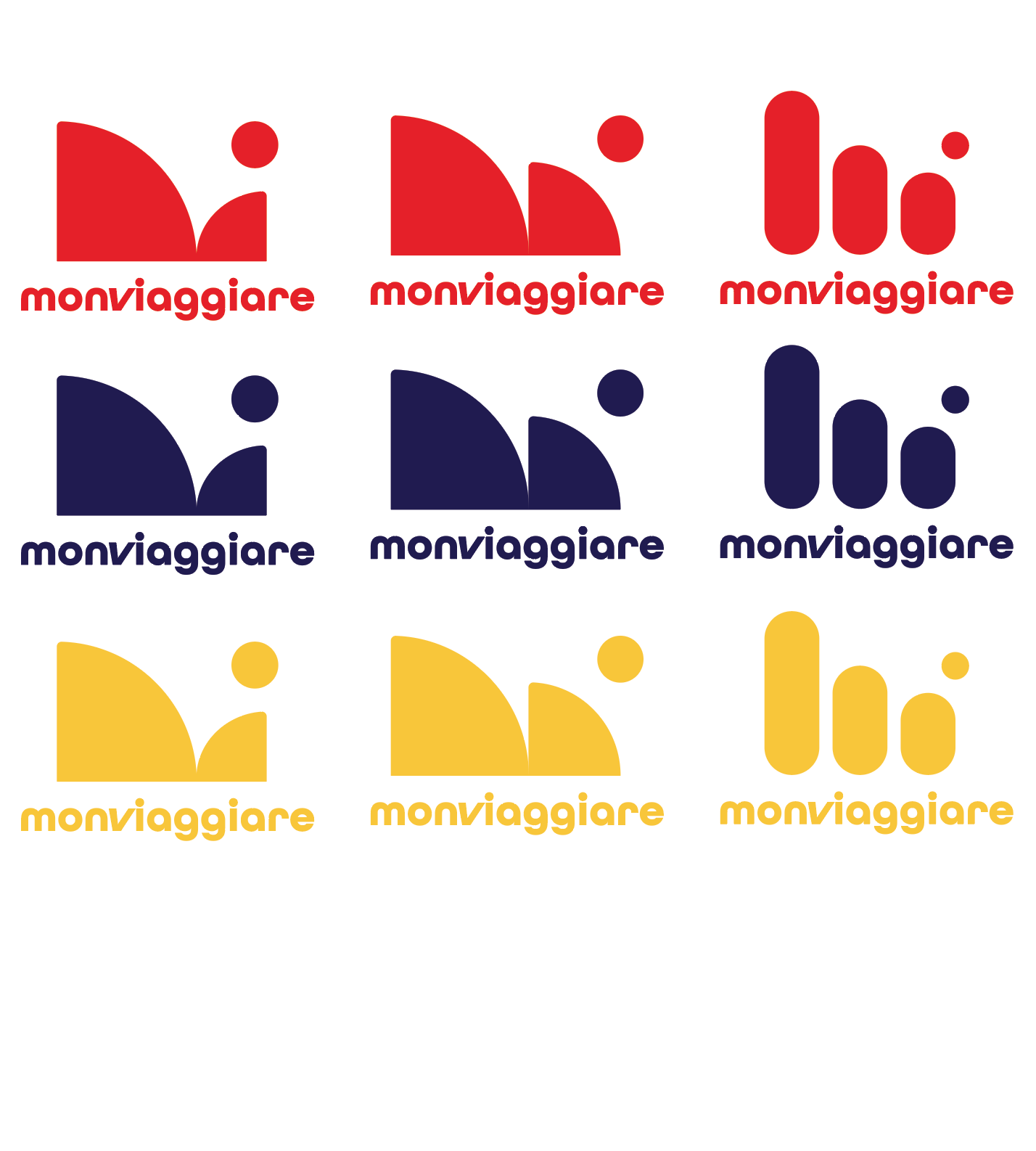
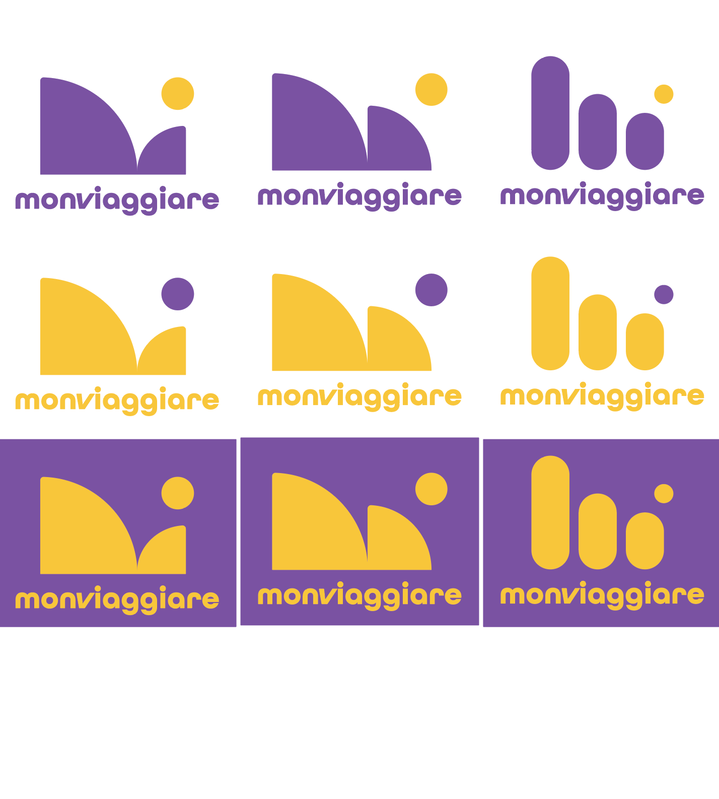
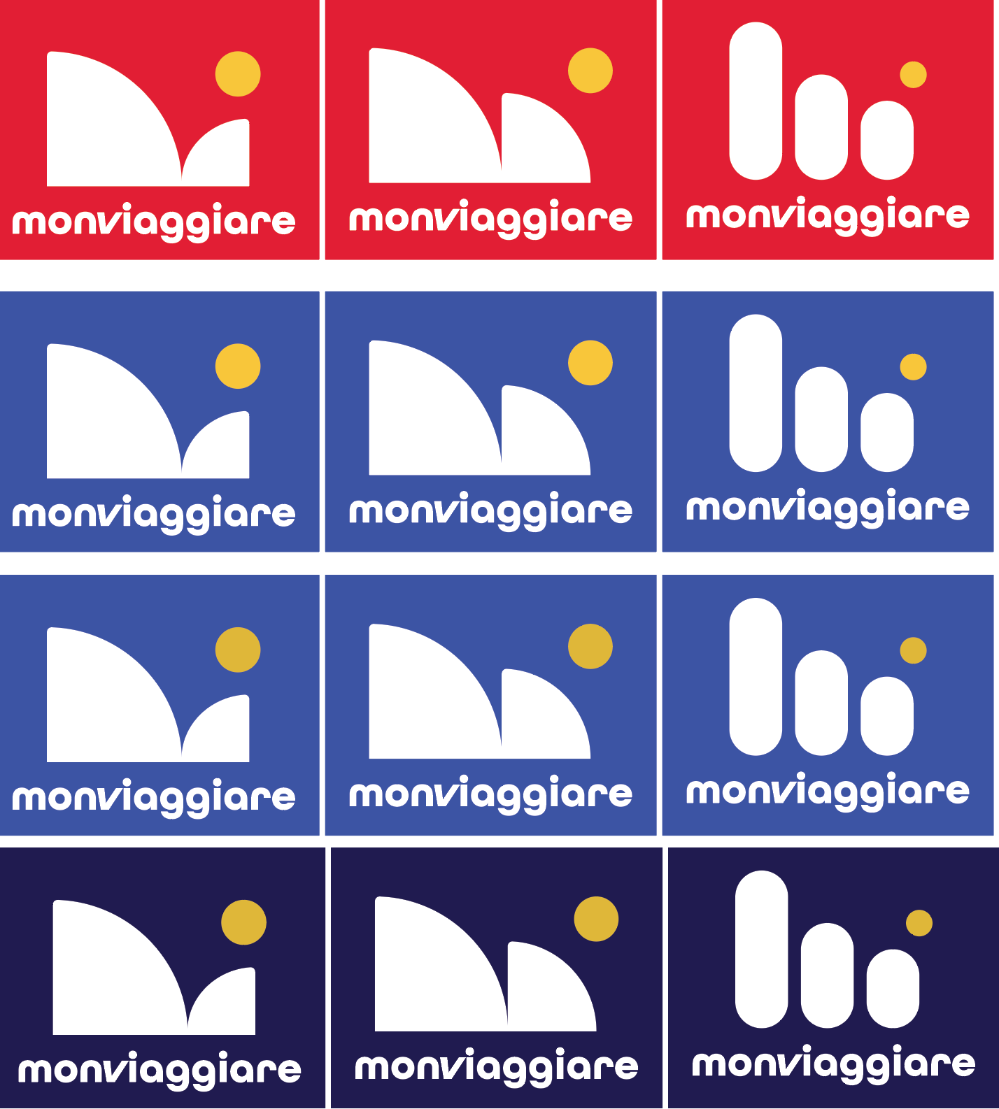
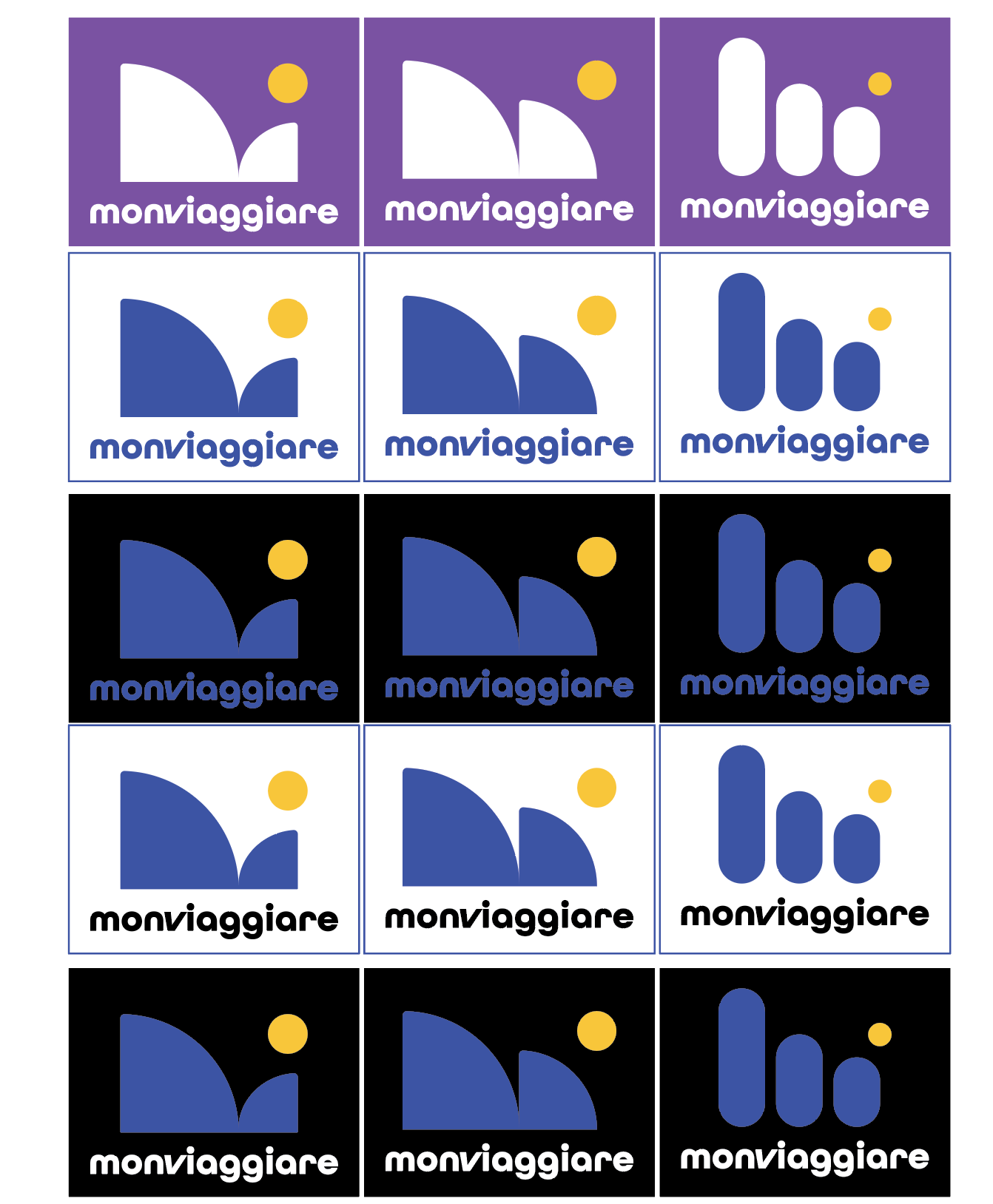
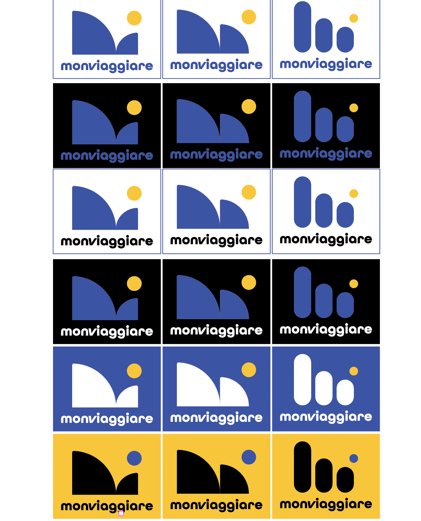
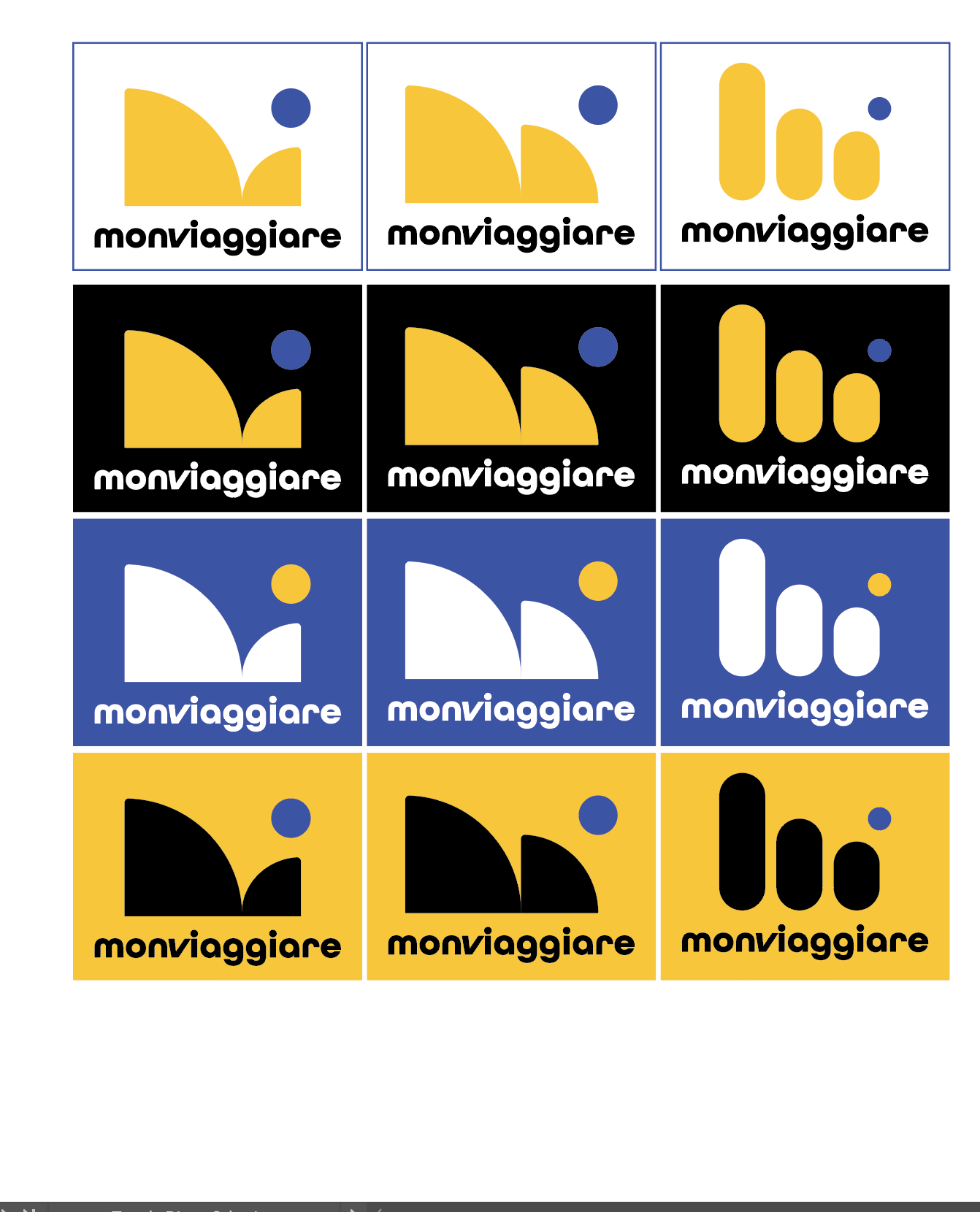
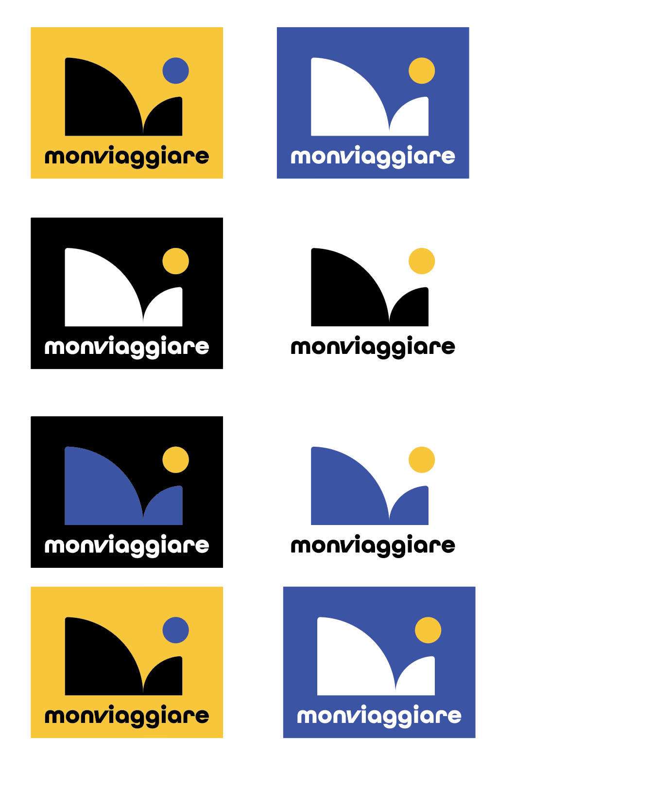
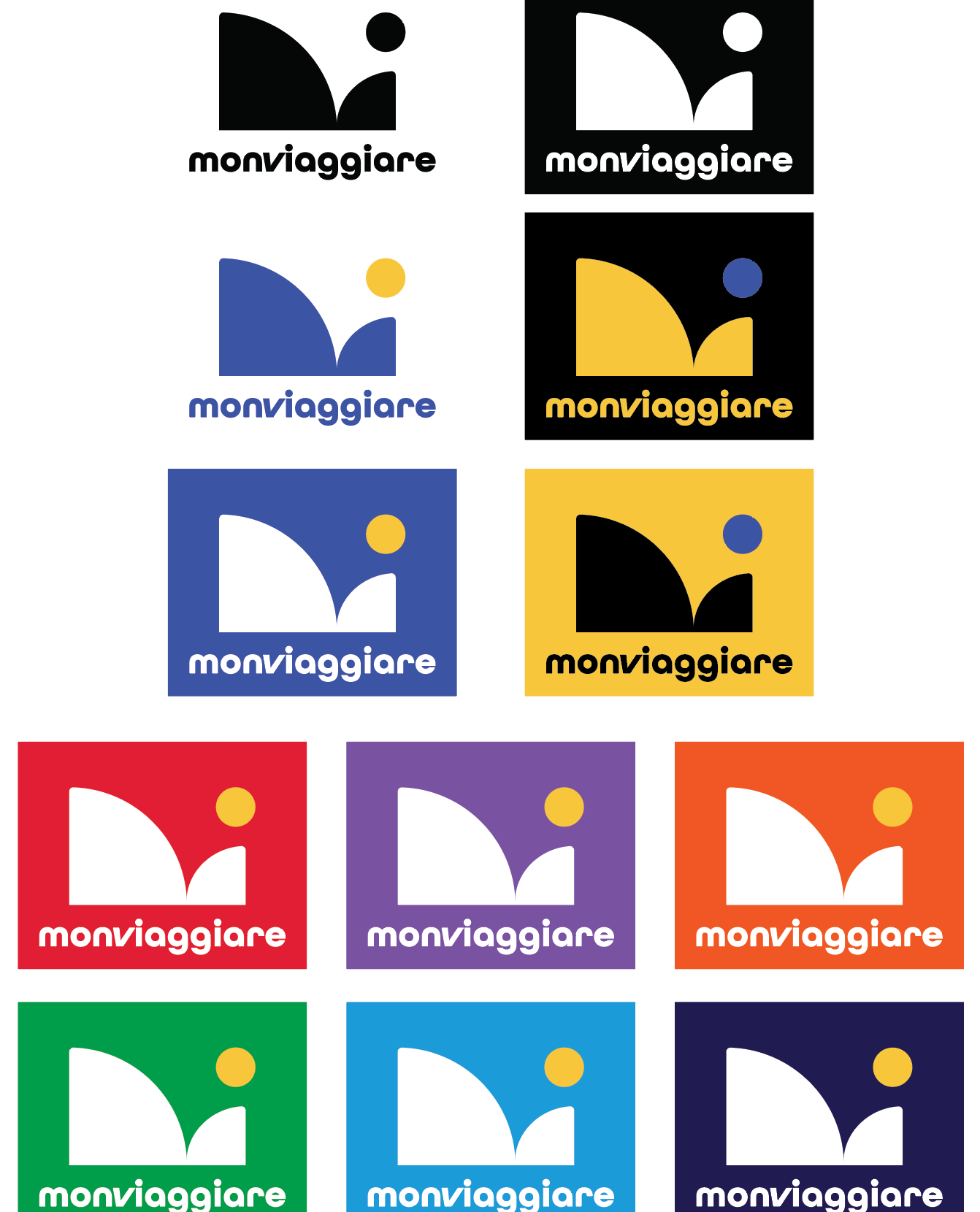
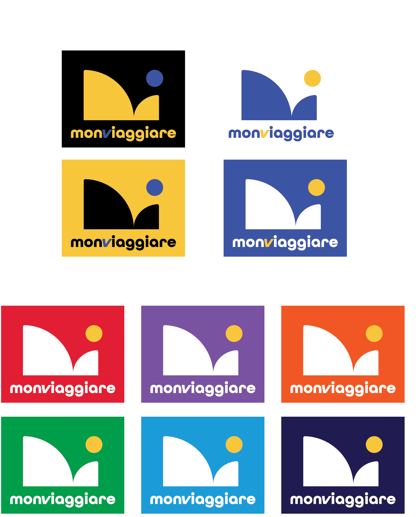
The concept features the letters m and v abstractly using shapes and negative space. The proposal intends to show movement within its composition with a ball that optically moves from left to right. The (1) more oversized shape is an abstract m formed in a similar style to the Bauhaus, (2) the v is seen in the negative space (as a rock skipping water, and (3) the circle represents the World. Its type is rounded and modern to integrate seamlessly with the symbol. This identifier is intended to work on big and small scales.

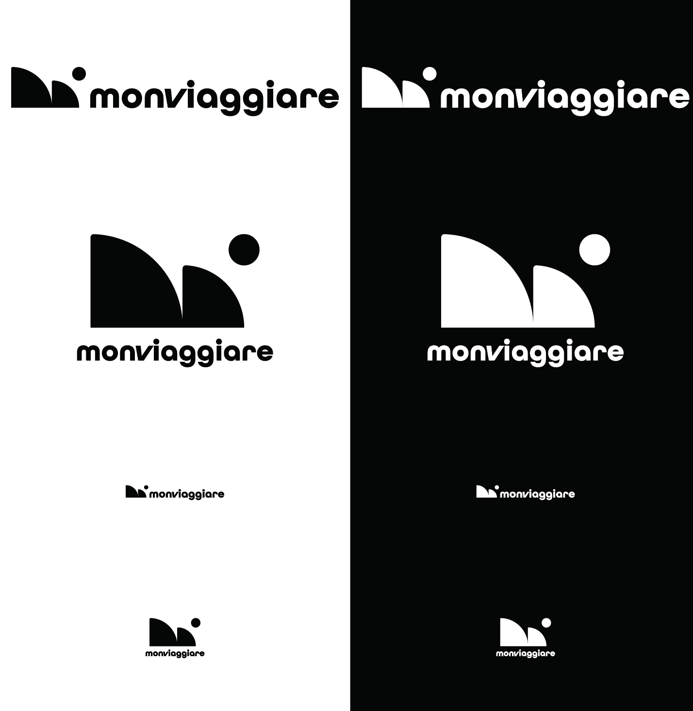
Principal Identifier
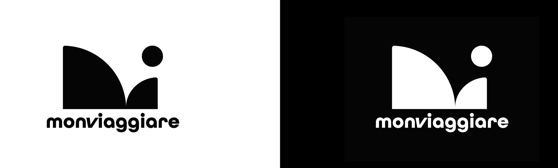
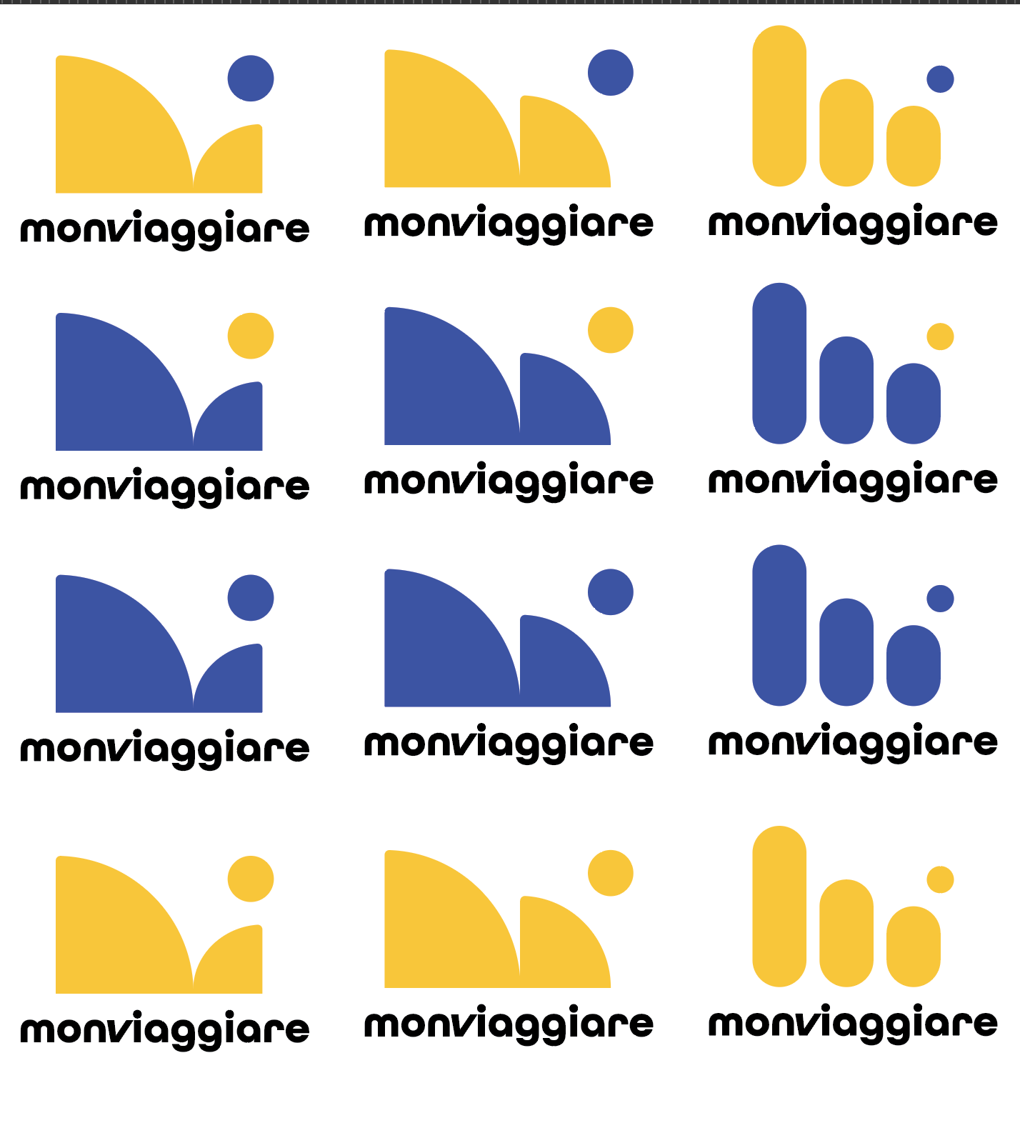
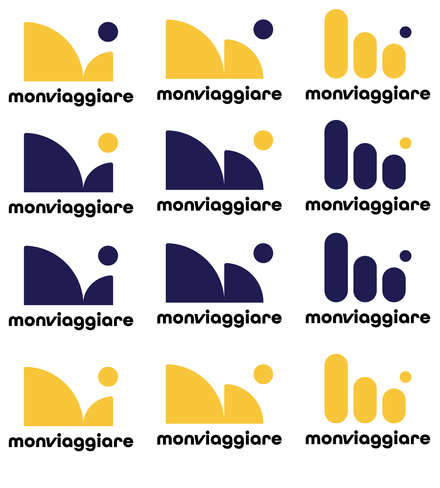
Black and White

Full Color
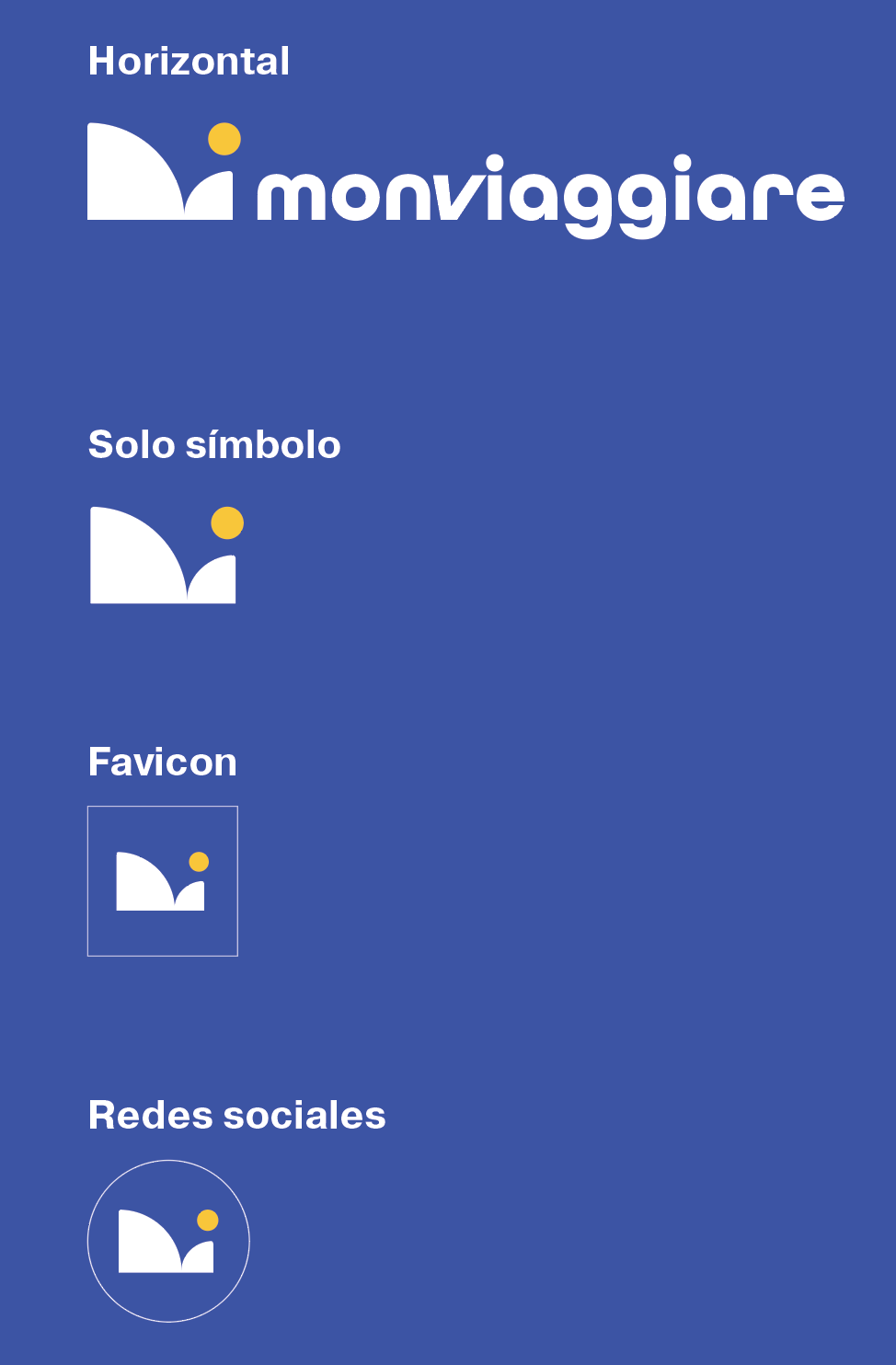
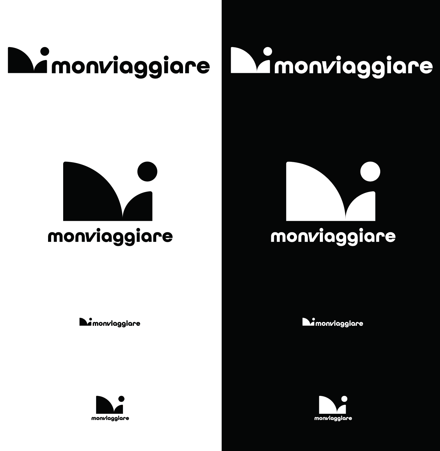
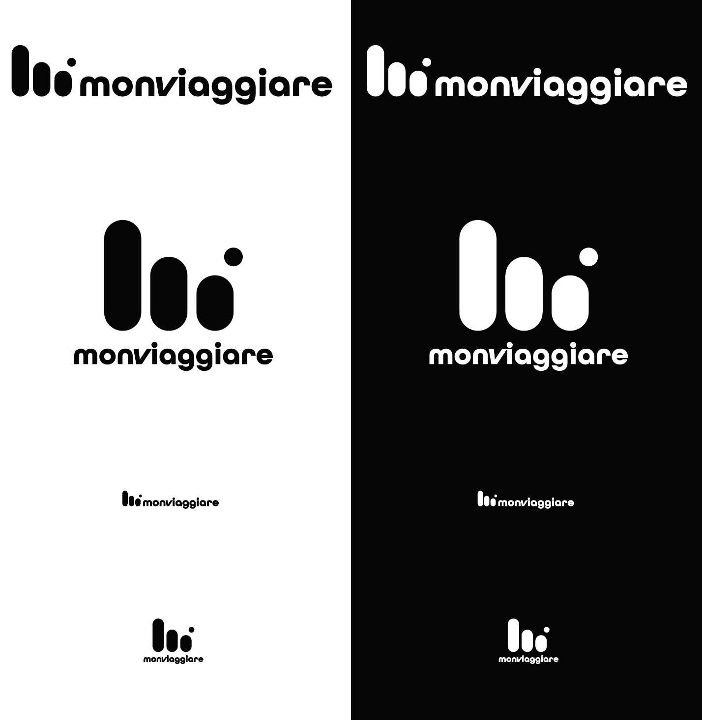
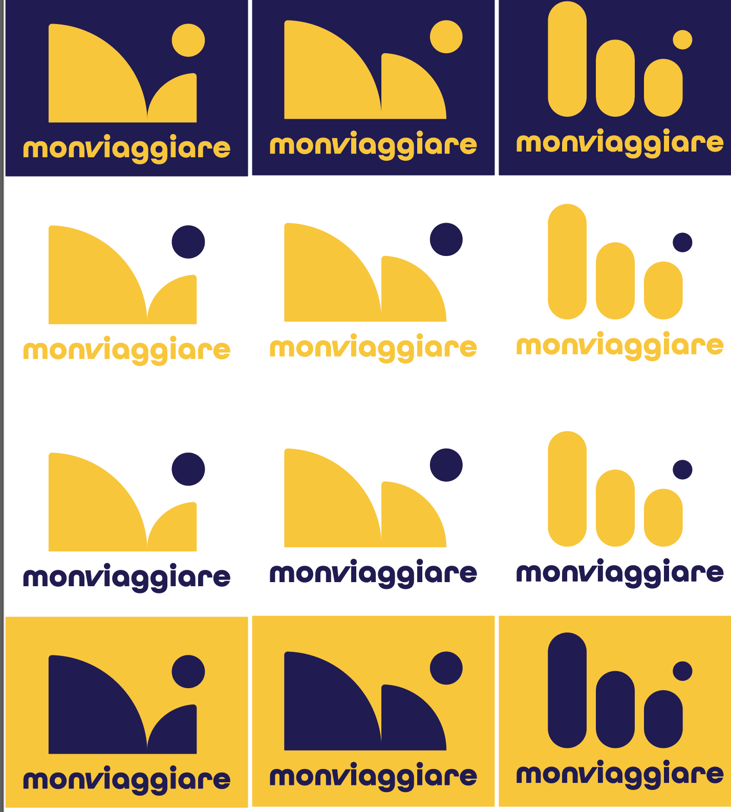
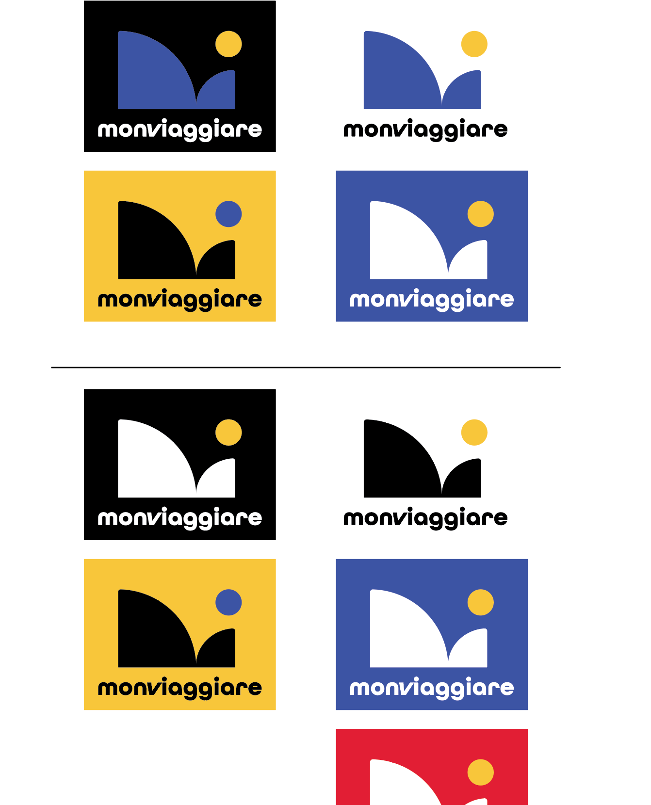
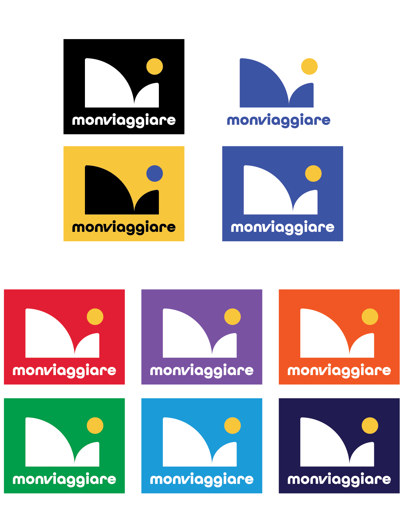
Variations
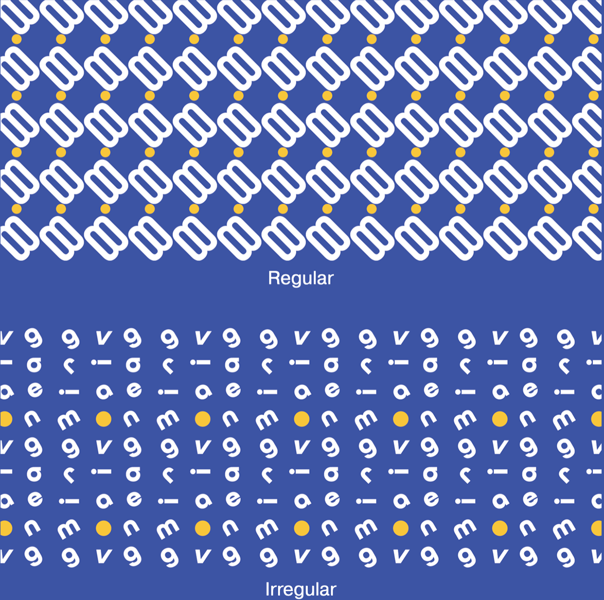
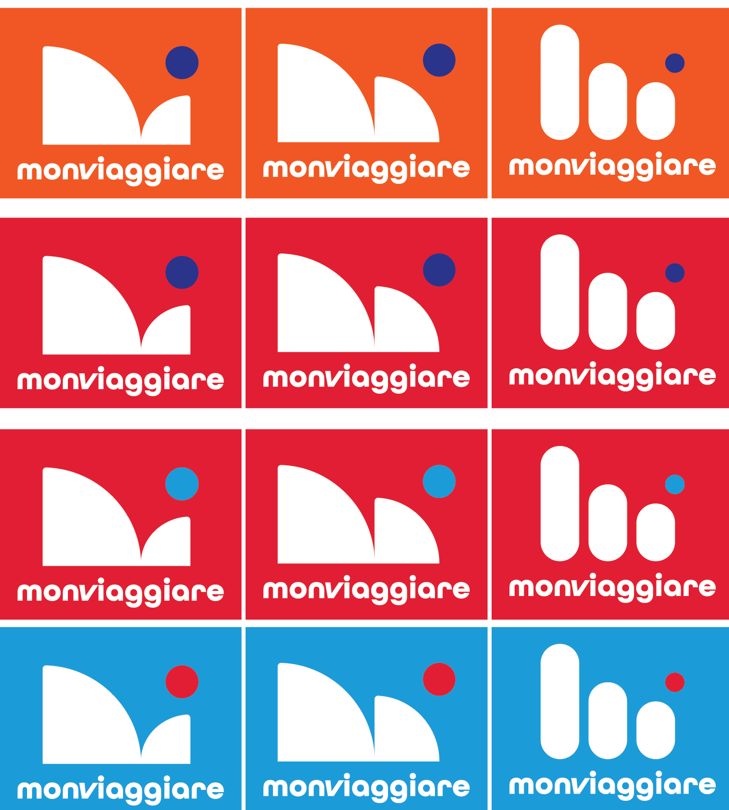
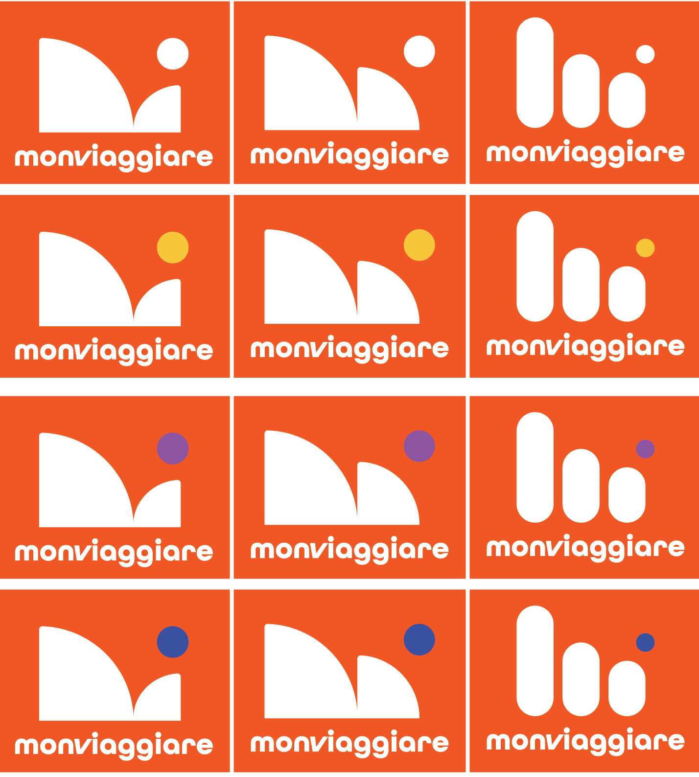
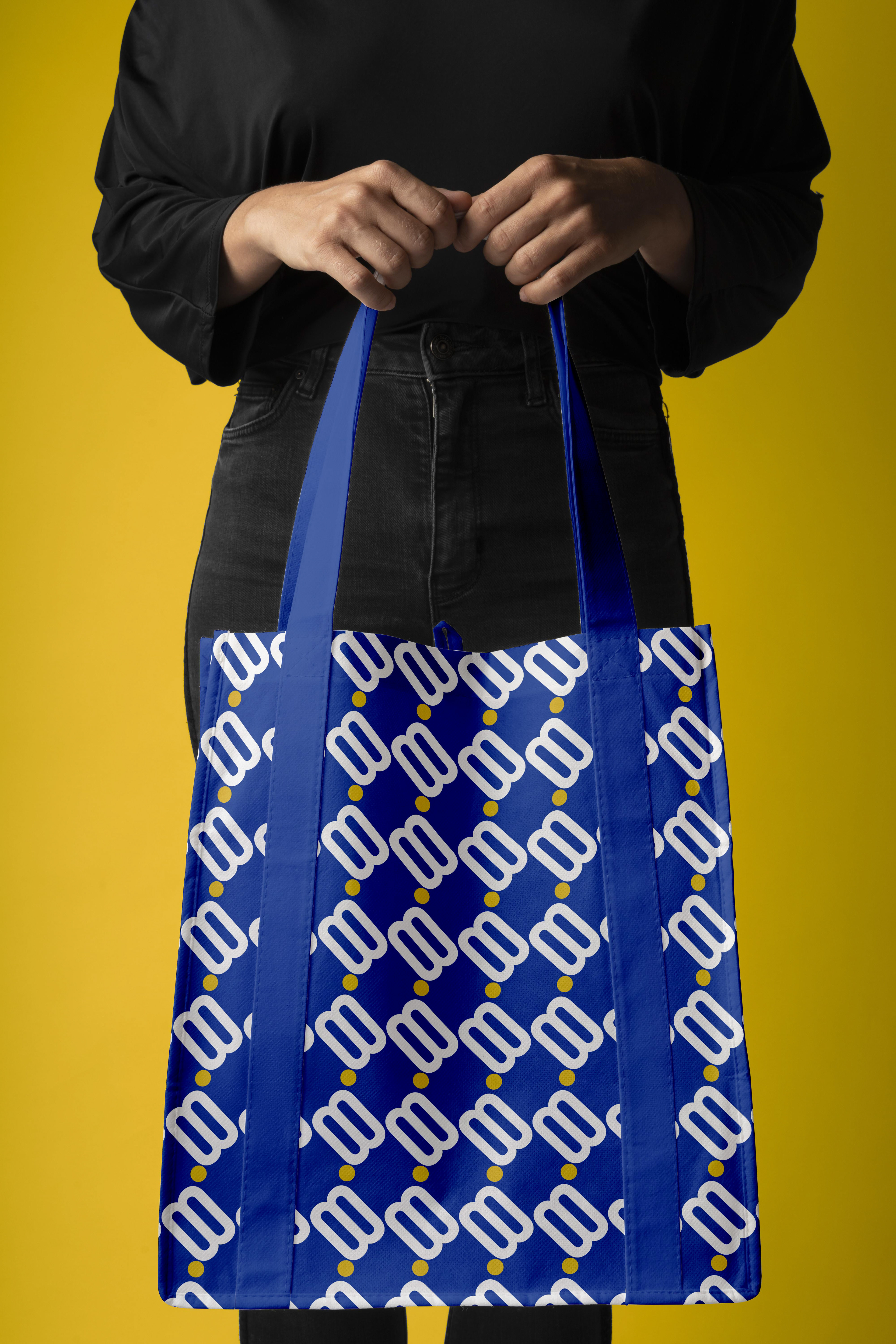
Patterns
CONCEPT Use
description
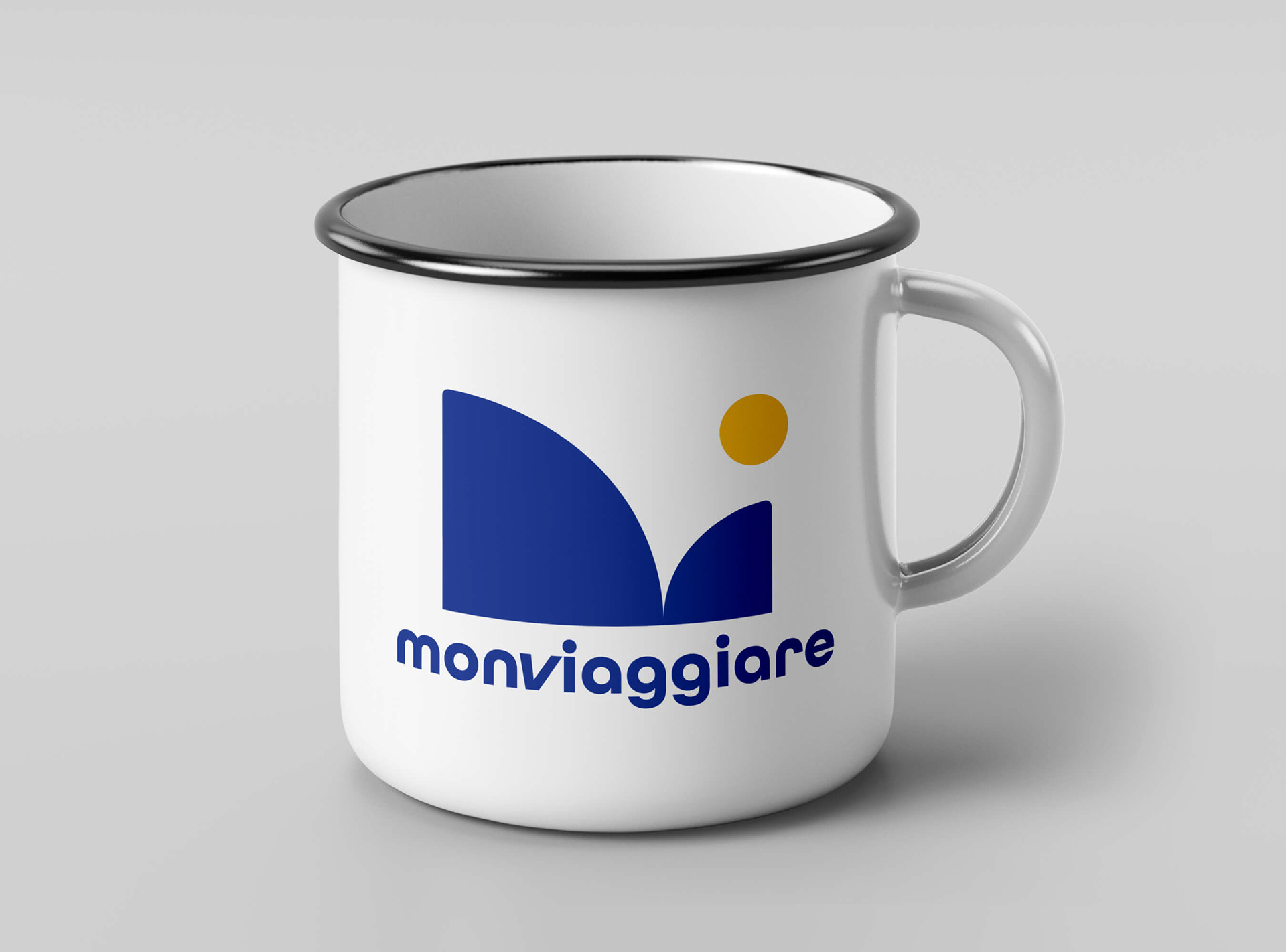
As part of its corporate identity, it is essential to make the client visualize how the proposed design can work. This can be done with mock-ups.
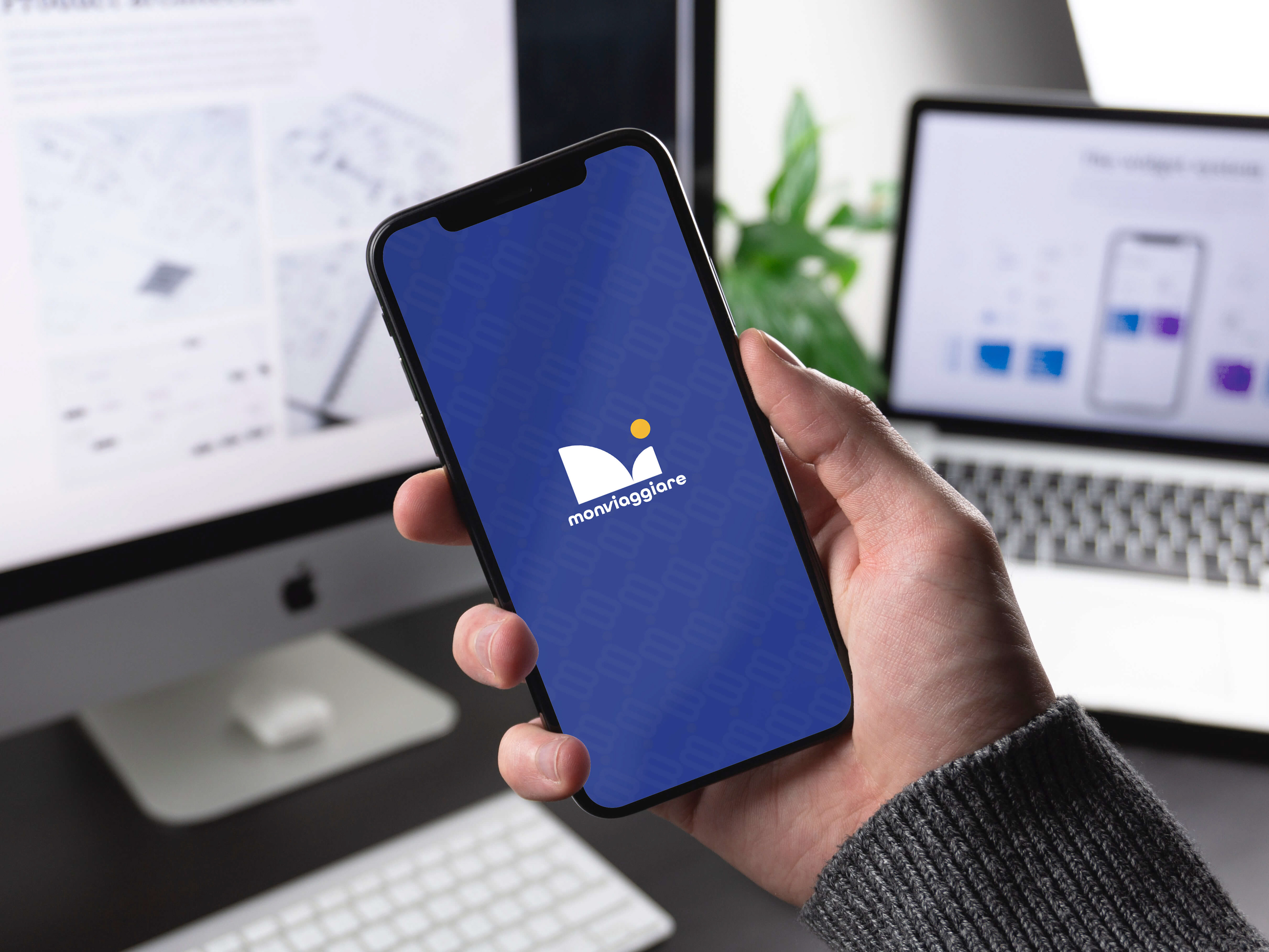
Digital
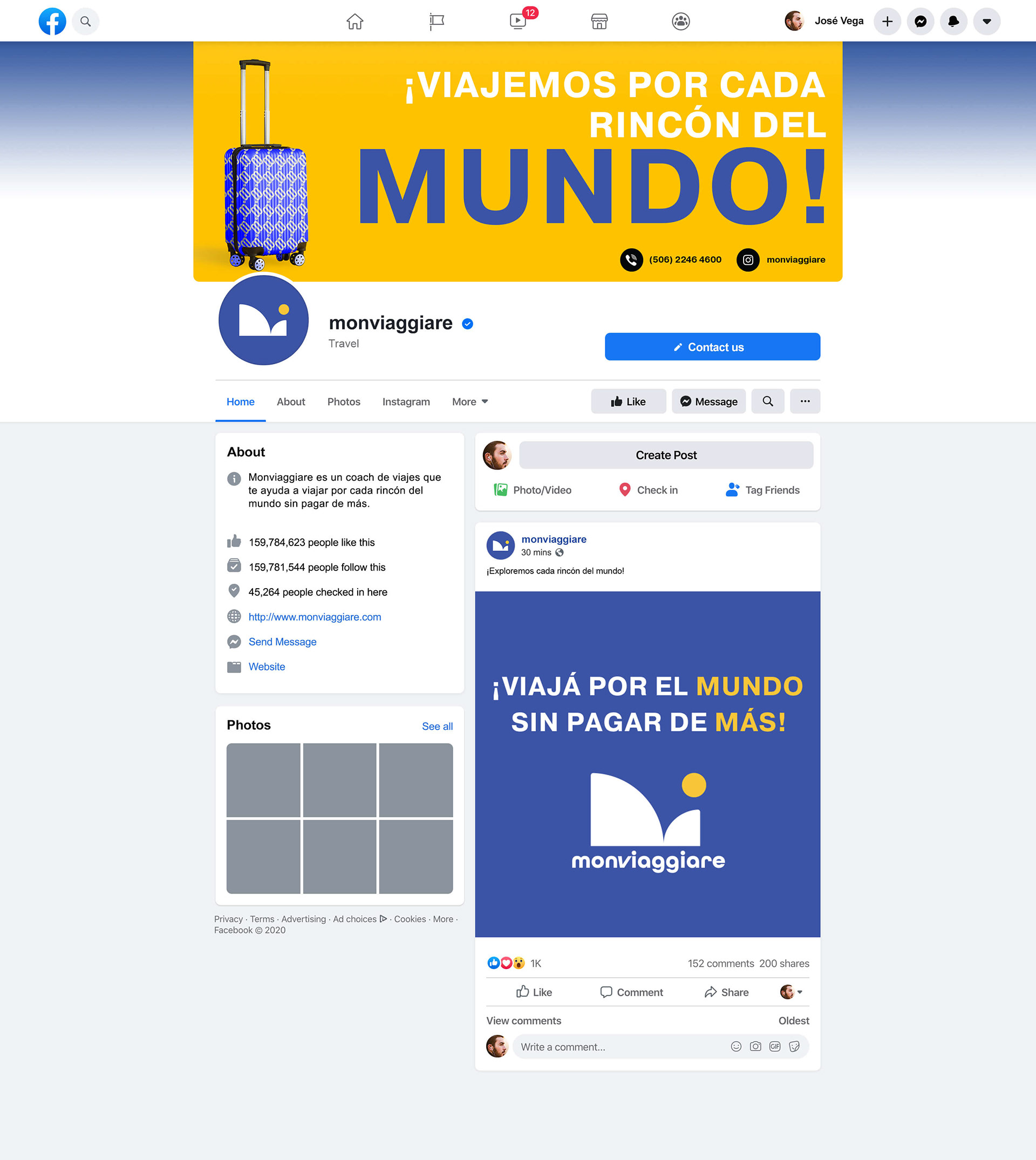
Digital
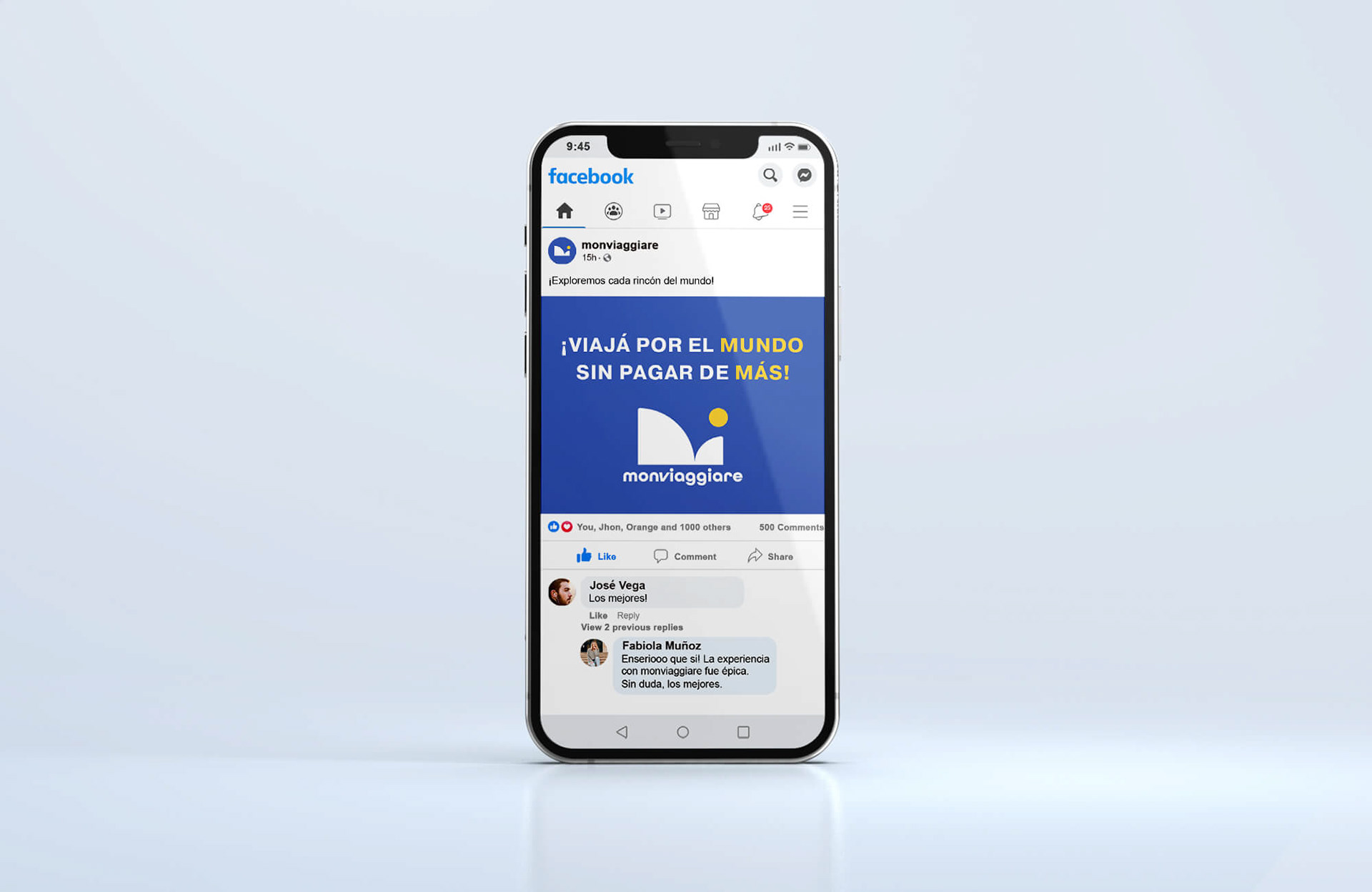
Digital
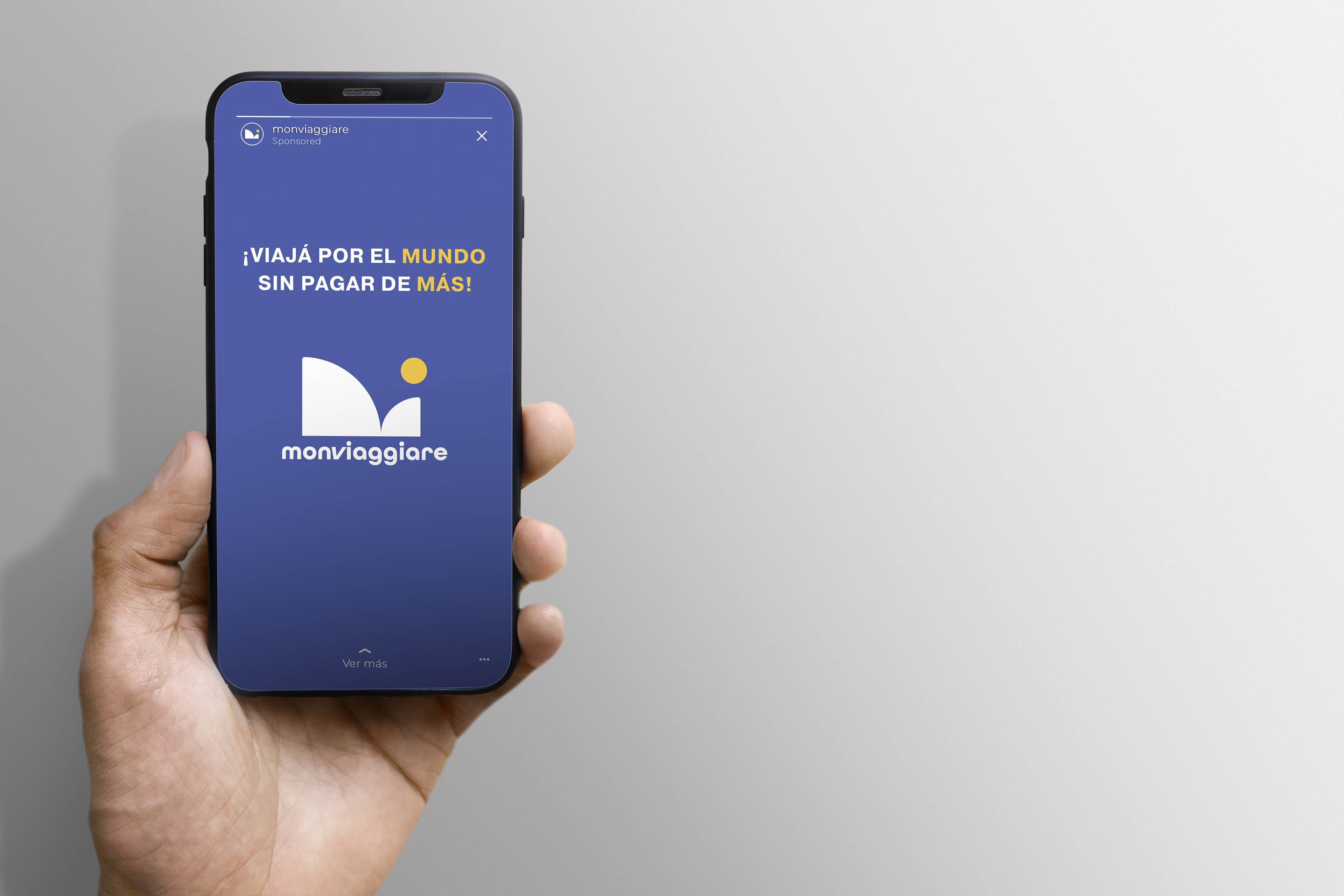
Digital
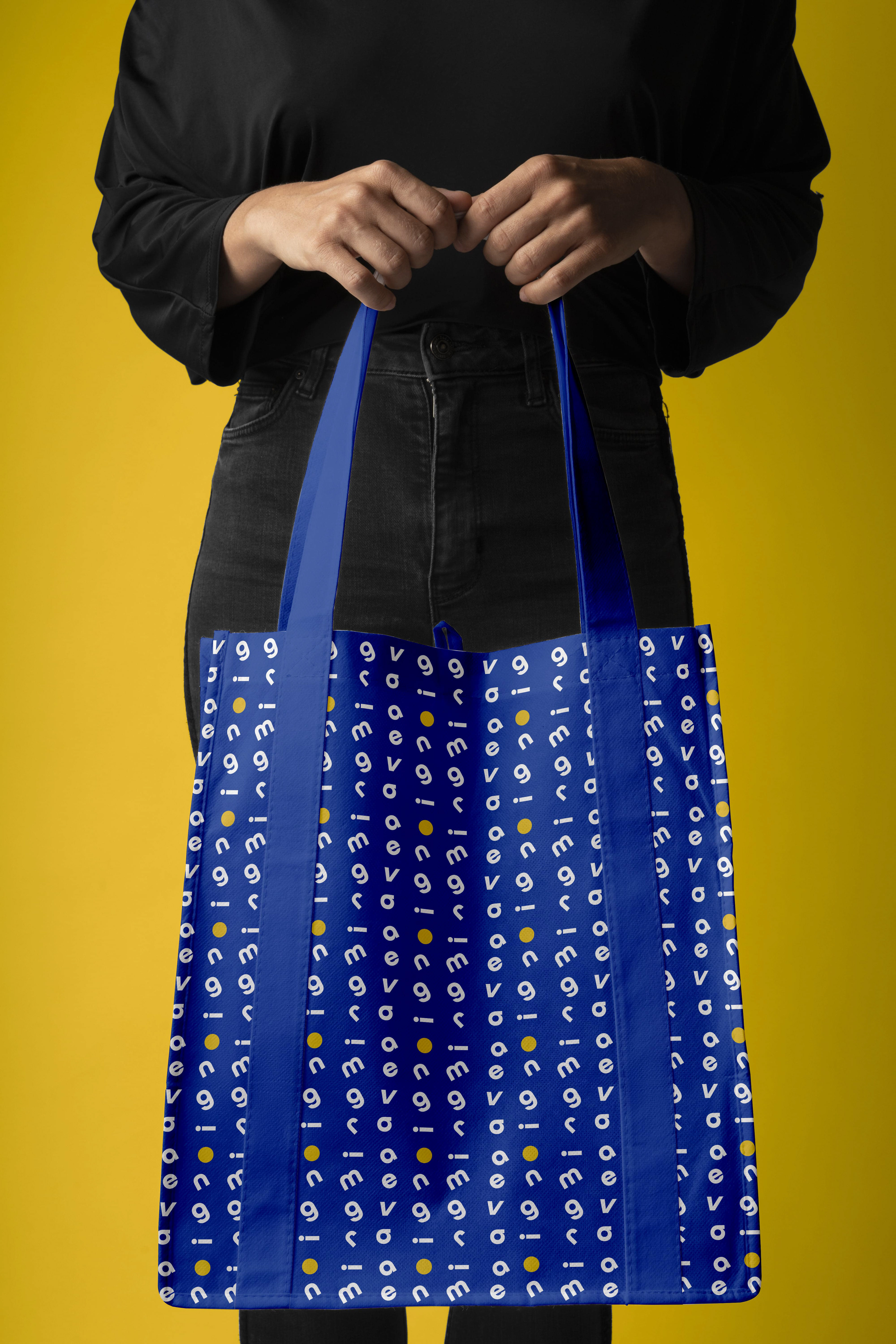
Merchandising
Merchandising
Merchandising
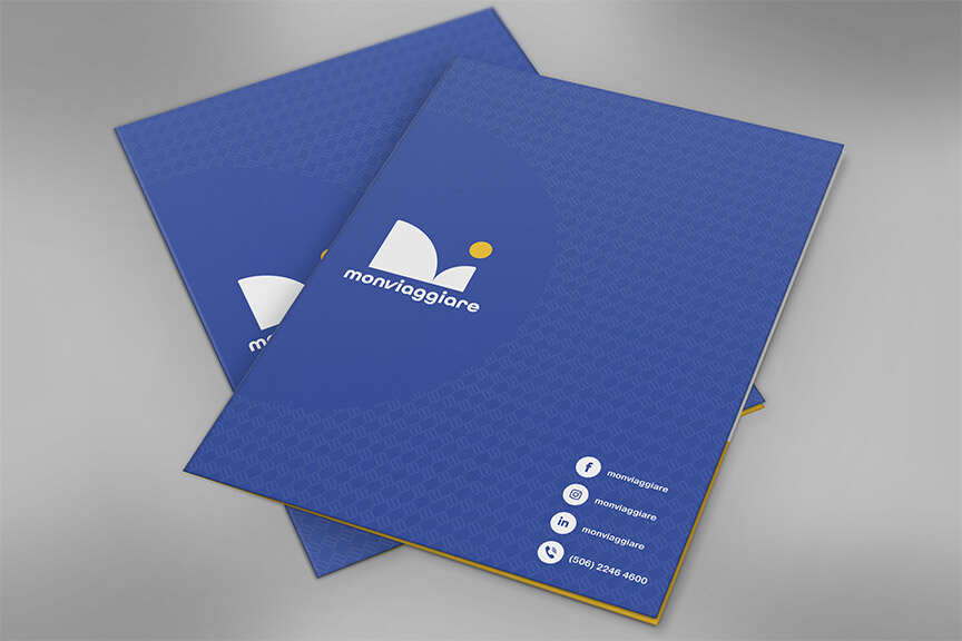
Corporate
Corporate

Corporate
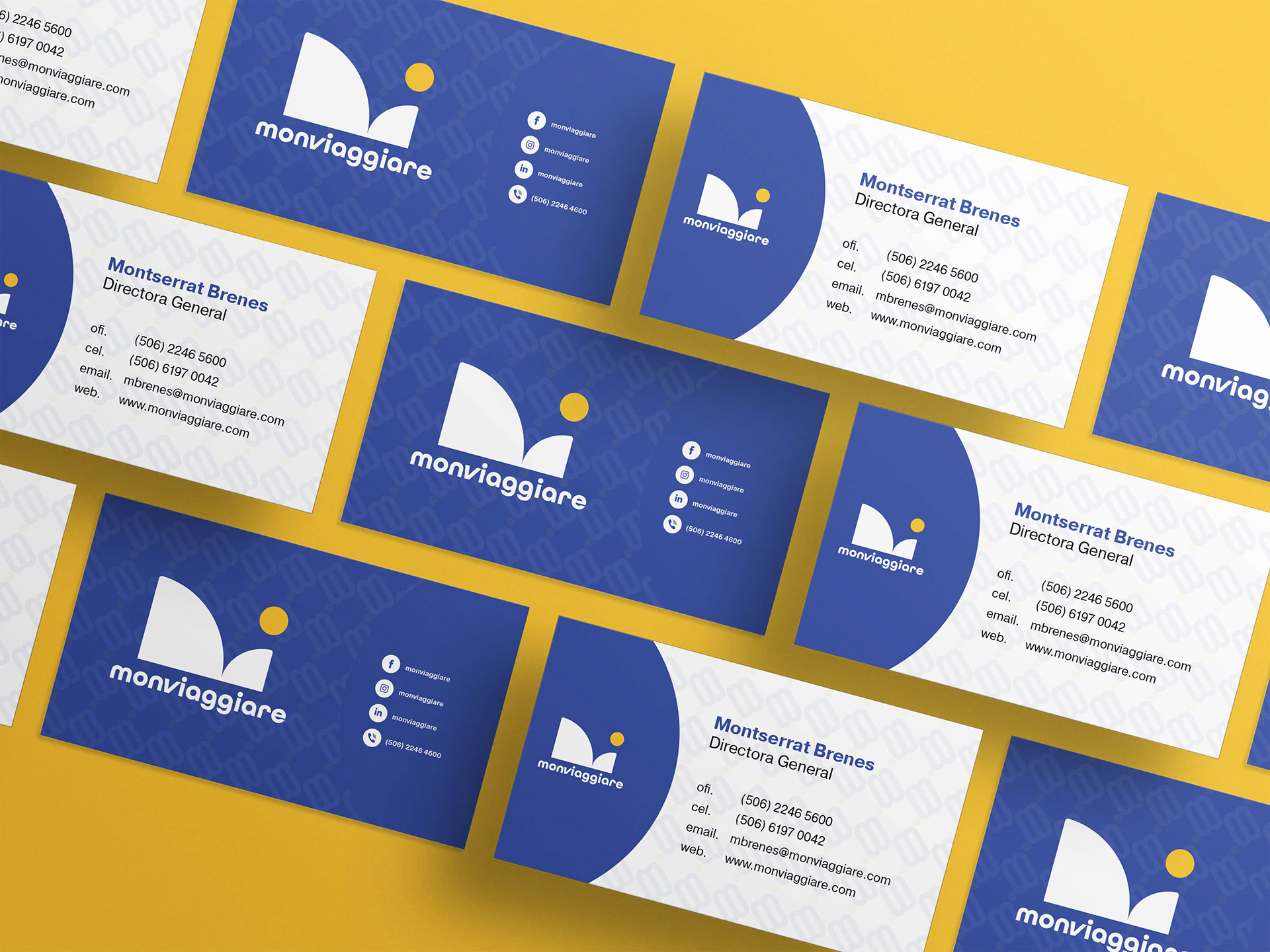
Corporate

Uniform
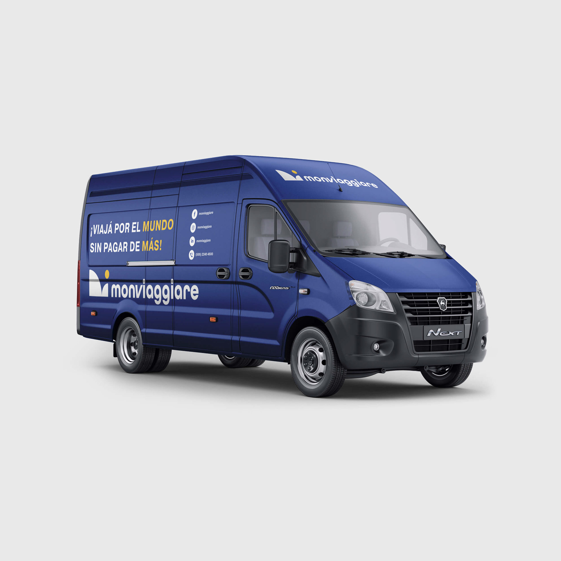
Vehicle
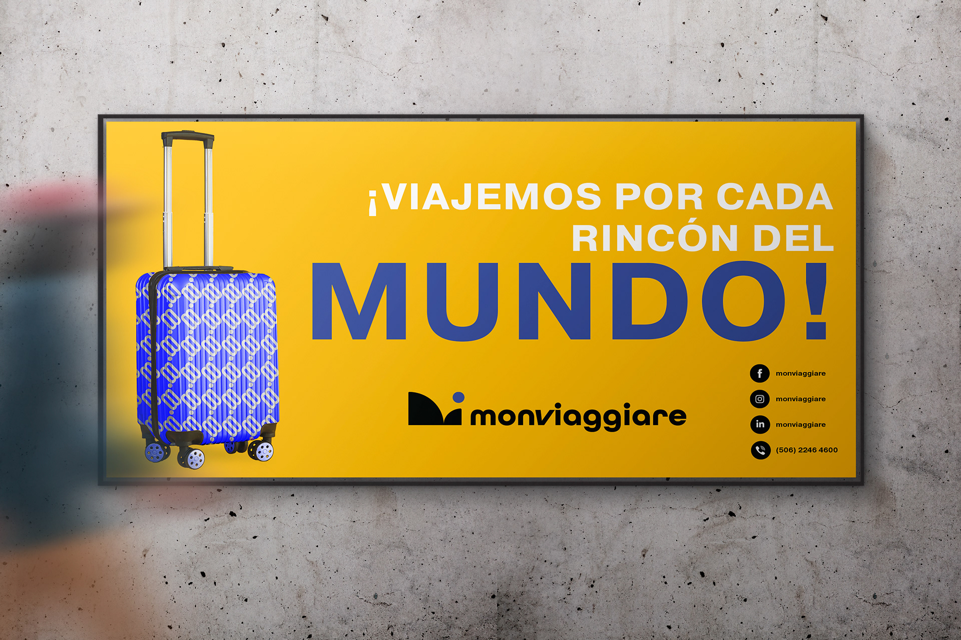
Billboard

Stickers
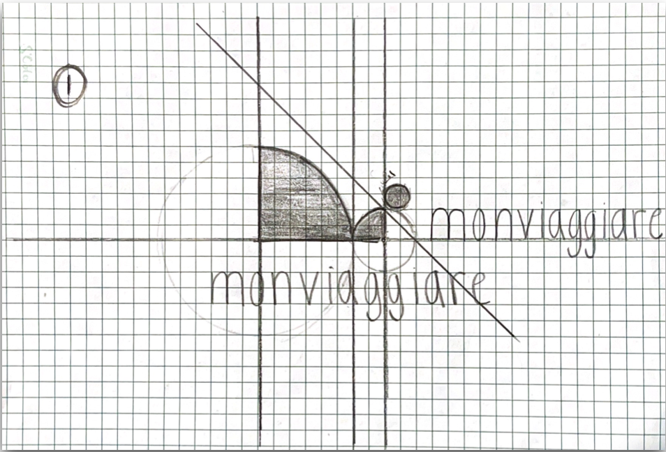
IDENTITY MANUAL
description
The manual is an essential part of any identity design work. The manual works as a guideline to establish the norms in how the identifier is best used. It offers a detailed description of how to use the identifier and how not to use it. Below are some examples of the manual.
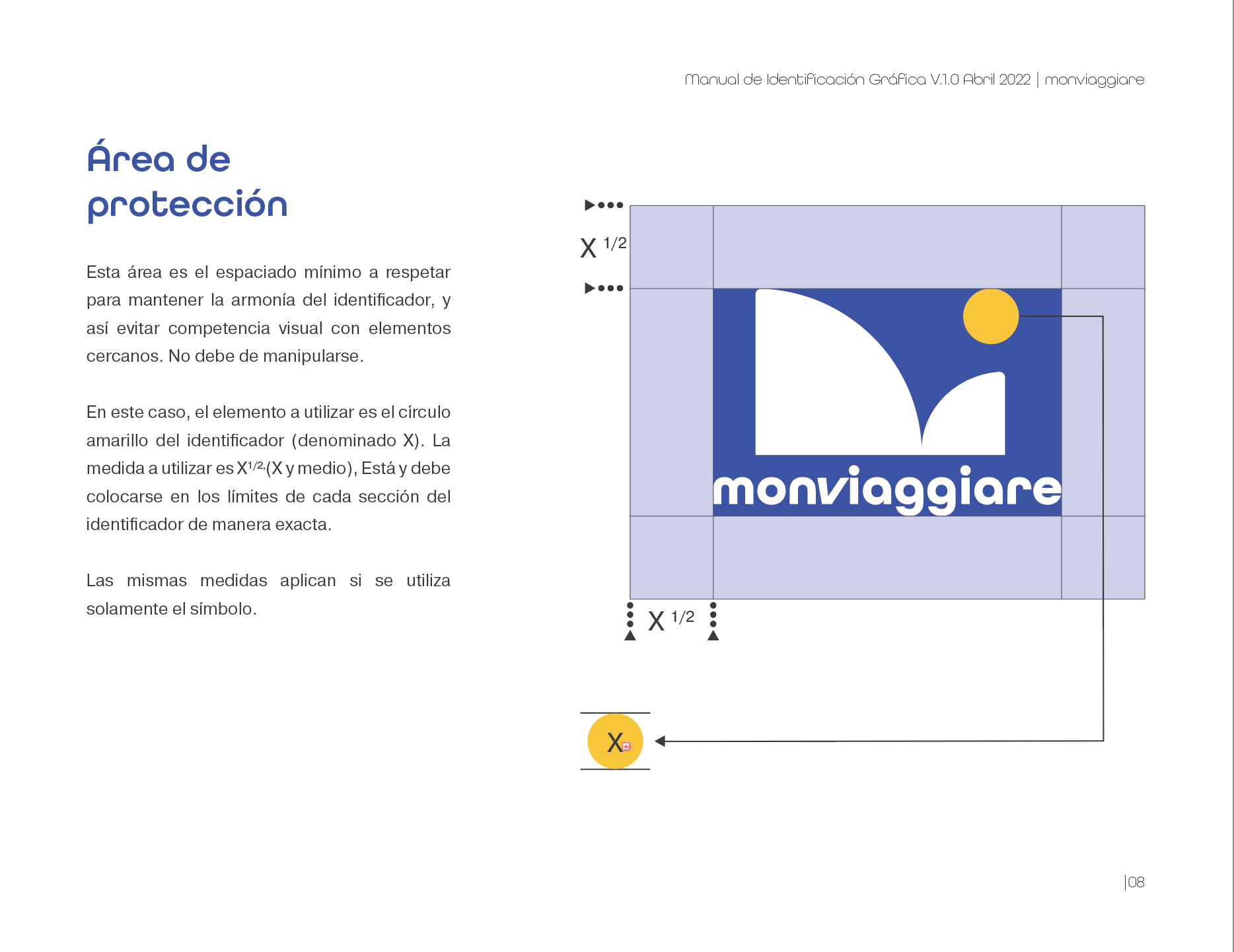
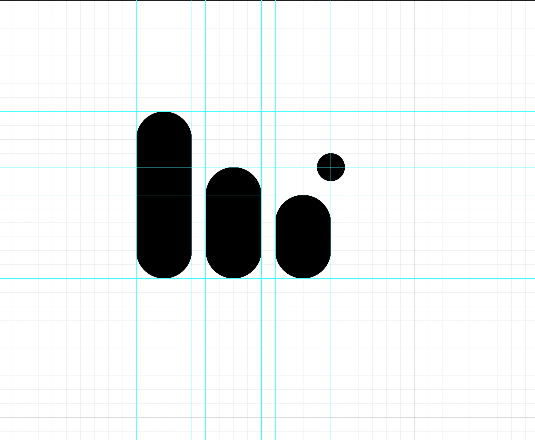
Protection Area
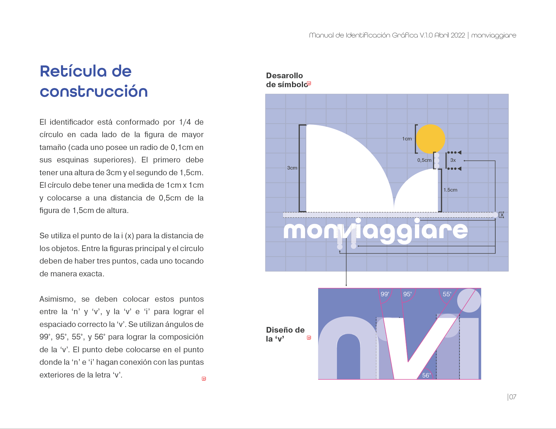
Symbol Specifics
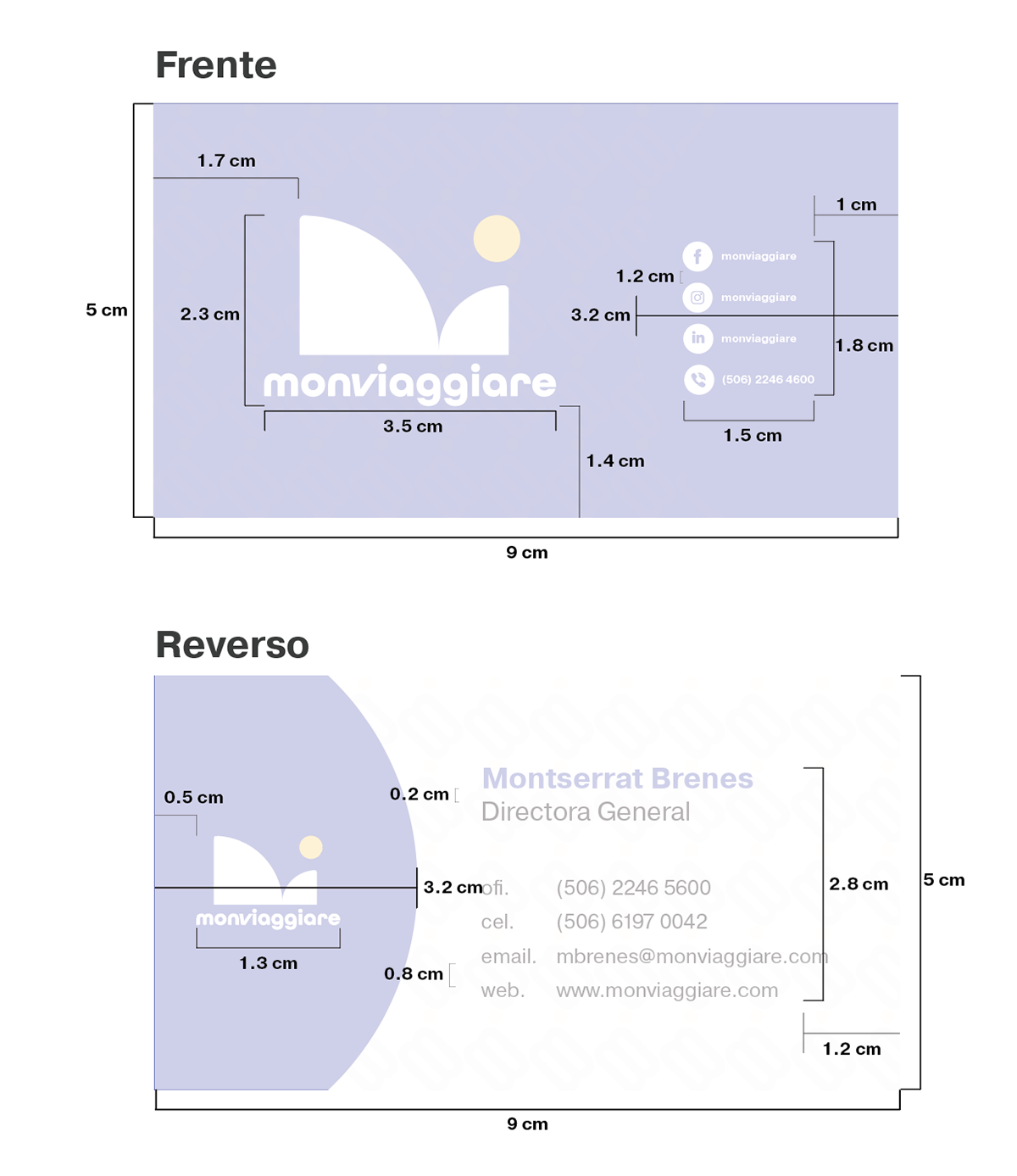
Card specifics
endgame
To create a corporate identifier that attends to the client's needs and sustains in the long term.
Special appreciation to all who contributed to making the project better.
Tools used: Illustrator & Photoshop